
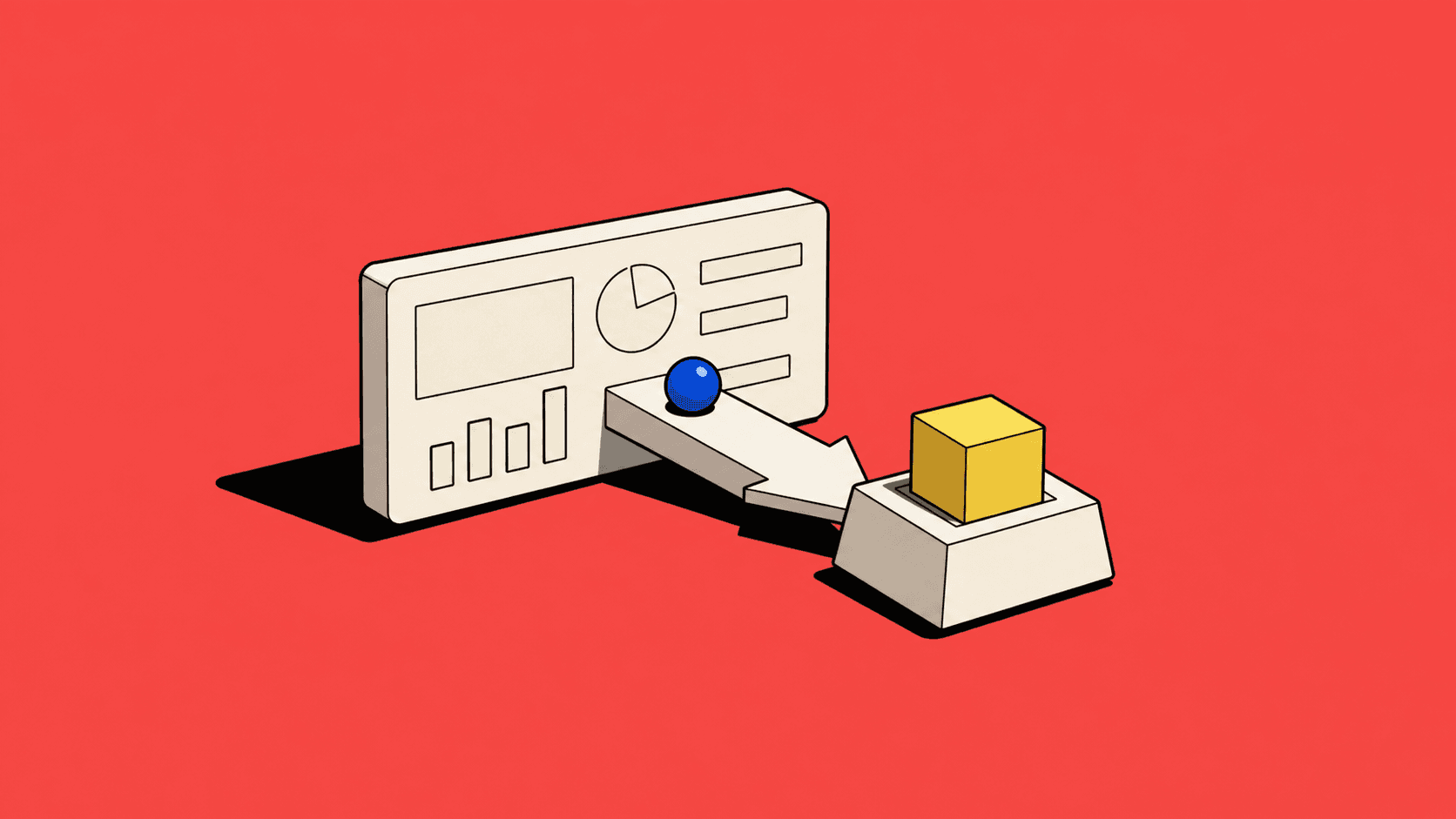
A dashboard debate can last three weeks and still fail to help a user do the next piece of work. Revenue wanted pipeline first. Operations wanted exceptions. Leadership wanted a chart that went up and to the right, ideally without the vulgar interruption of context. The users opened the dashboard and immediately navigated somewhere else.
That moment captures a common design mistake: confusing the place where information is displayed with the place where work gets done. A dashboard can be useful, but it is rarely the product. It is a window onto the product, and windows earn their keep when they help you see what needs attention.
The dashboard graveyard
Most dashboards begin with good intentions. Somebody asks for visibility. A designer produces a tidy grid. The team adds filters, trends and reassuring splashes of colour. Six months later, half the cards are ignored, two metrics have changed definition and one widget survives because a senior stakeholder once pointed at it during a meeting.
The problem is not visual design. Dashboards are often assembled from available data rather than designed around decisions. “What can we show?” is a database question wearing a product hat. The better question is: “What does this person need to notice, decide or do next?”
The GOV.UK guidance on measuring success recommends combining performance metrics with user research and looking beyond digital analytics. A neat number can tell you what happened while remaining magnificently silent about why.
Start with the decision
When I design an operational product, I list the decisions people make during the day. Which request needs attention? Which quote is at risk? Which approval is blocking progress? Which customer needs a response? The dashboard becomes a prioritisation surface, not a wall-mounted aquarium of metrics.
Instead of “23 pending items”, show the four that are overdue, the two with financial exposure and the one that changed while the user was away. The total still matters, but context makes it actionable. People do not need a census of their workload. They need help choosing where to start.
That principle shaped my work on complex marketplace products. In the Aerios carrier marketplace case study, a request was never just a row. It carried route, customer, status, timing and commercial implications. Reducing that to a number would have produced a clean dashboard and a fairly useless product.
Design for interruption
B2B users rarely approach dashboards in the serene conditions shown in stock photography. They return from meetings, switch between customers, answer messages and inherit work from colleagues. A useful dashboard restores context. It explains what changed, what is urgent and what can wait.
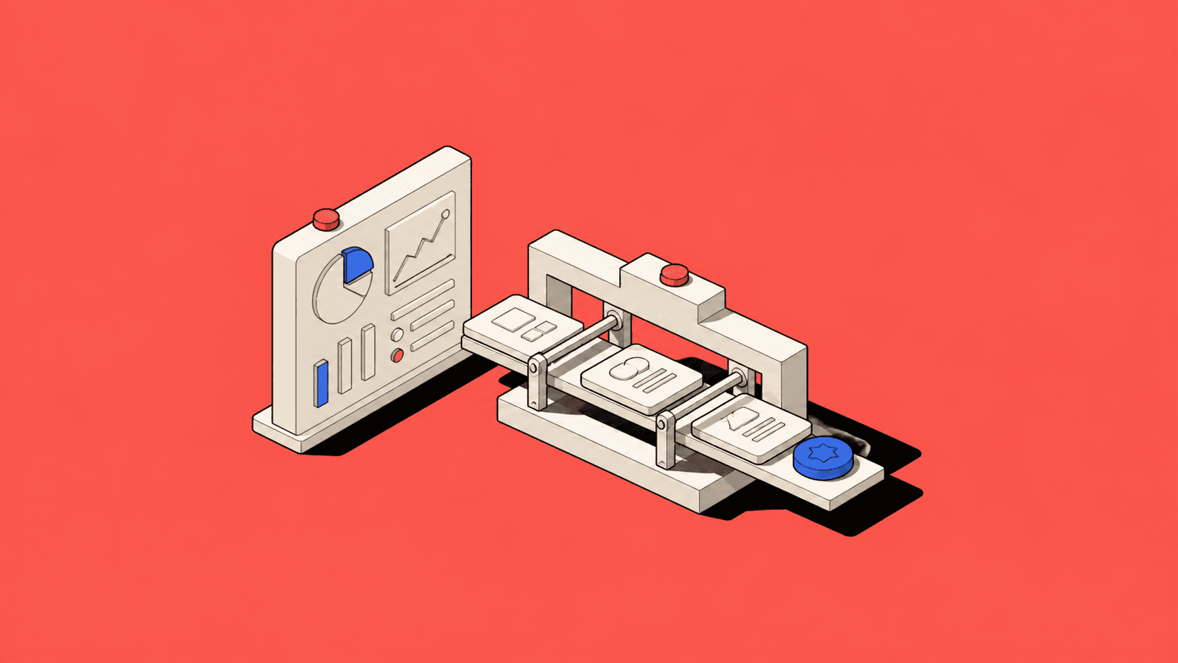
Recency and status matter. “Last updated” is not decorative metadata when information moves between systems. Ownership is not a nice-to-have when several people can act on the same record. A warning without a recovery path is merely anxiety with an icon.
I test dashboards with a return-visit question: if someone has been away for two days, can they understand the current situation in under a minute? If the answer requires opening twelve records and consulting a spreadsheet, the dashboard is performing more as a foyer than a workspace.
Use layers, not clutter
The answer is not to put every detail on the first screen. Good dashboards use layers. The first identifies priority and state. The next explains the evidence. The final supports action. This keeps relevant information visible while allowing detail on demand.
The Nielsen Norman Group usability heuristics remain useful here, particularly visibility of system status and recognition rather than recall. Progressive disclosure should match detail to the decision, not hide important information behind mystery-meat controls.
A finance lead and an operations coordinator may look at the same request but need different summaries. Role-based views can help, provided they do not create parallel realities where nobody can explain why colleagues see different truths.
Measure whether it changes behaviour
Dashboard success is often measured by views, which is like measuring a fire exit by how many people looked at the sign. I care more about what happens afterwards. Do users identify urgent work faster? Are fewer items missed? Does handover improve? Do support teams receive fewer “where is this?” questions? Does the dashboard reduce time spent assembling reports by hand?
These measures connect interface behaviour to operational outcomes. They also reveal when a dashboard should become something more direct: a queue, alert, saved view or automated action. Sometimes the best improvement is removing a chart and notifying the right person at the right moment. Designers survive this. Charts are surprisingly resilient too.
A useful dashboard knows its place
A dashboard should not try to prove that the product contains data. Users had probably suspected as much. It should help them regain context, notice risk and move into meaningful work with confidence.
Begin with decisions, design for interruption, reveal detail in layers and measure the behaviour that follows. If users still skip the dashboard, do not add another card. Follow them. They may be showing you where the real product has been hiding.

