Redesigning the Aerios Carrier Marketplace

Redesigning the Aerios Carrier Marketplace

Creating a scalable aviation charter platform through product strategy, UX systems thinking, and a new design system

PROJECT RESULT

10X

Increase in product delivery output following a redesigned product delivery process and reusable UX patterns

10X

Increase in product delivery output following a redesigned product delivery process and reusable UX patterns

60 to 75%

Target reduction in design time for repeatable screens through reusable design system components

60 to 75%

Target reduction in design time for repeatable screens through reusable design system components

40 to 60%

Target reduction in front-end ambiguity through standardised interaction patterns, component states, and clearer handoff

40 to 60%

Target reduction in front-end ambiguity through standardised interaction patterns, component states, and clearer handoff

30%+

Target reduction in task friction across high-frequency workflows such as quoting, booking progression, and document navigation

30%+

Target reduction in task friction across high-frequency workflows such as quoting, booking progression, and document navigation

This is just to be used as guidance rather than set in stone.

Aerios is a commercial aviation platform used by aircraft carriers to manage the charter workflow from availability and quote creation through to bookings, documents, and invoices.

The carrier application had grown quickly in response to customer demand, but the user experience had become increasingly fragmented. Workflows were powerful, but inconsistent. Screens had been added quickly, patterns varied across the product, and complex commercial users needed a clearer way to move through quote, booking, and transaction workflows.

My role was to lead the redesign of the carrier application and establish a new design system that could support the next stage of product growth. This meant working across product strategy, customer discovery, requirements gathering, UX audit, interaction design, prototyping, design systems, user testing, and delivery alignment with engineering.

The goal was not just to make the product look better. It was to make Aerios easier to sell, easier to use, faster to build, and more scalable for enterprise aviation customers.

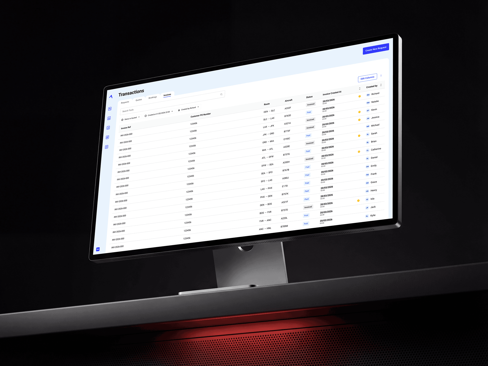
A computer monitor display

Senior Product Owner / Product Design Lead

I led the product and UX direction for the carrier application redesign, working across:

Roles

01 Product strategy

02 Requirements gathering

03 Customer discovery

04 UX audit

05 Information architecture

06 Interaction design

07 Design system strategy

08 Figma prototyping

09 AI-assisted design exploration

10 User testing

11 Heat map and behavioural analytics planning

12 Engineering handoff

13 Delivery prioritisation

Aerios had strong product-market pull but the carrier application had grown faster than the underlying UX system.

New customer requirements had been delivered quickly, but over time this created visible fragmentation across the interface. Different areas of the product used slightly different layouts, inconsistent form patterns, varied table behaviours, mixed terminology, and disconnected navigation models.

For a platform dealing with complex aviation workflows, this created several problems:

Users had to interpret different interaction patterns across Requests, Quotes, Bookings, Invoices, and Settings

Users had to interpret different interaction patterns across Requests, Quotes, Bookings, Invoices, and Settings

Key workflows such as quote creation, booking progression, contract generation, and document navigation felt disconnected

Key workflows such as quote creation, booking progression, contract generation, and document navigation felt disconnected

Commercial teams could lose confidence when records appeared duplicated across different screens

Commercial teams could lose confidence when records appeared duplicated across different screens

Engineering teams had to rebuild similar patterns repeatedly

Engineering teams had to rebuild similar patterns repeatedly

New feature delivery became slower and harder to QA

New feature delivery became slower and harder to QA

The product was becoming harder to scale for larger enterprise customers

The product was becoming harder to scale for larger enterprise customers

The central UX challenge was to transform Aerios from a collection of powerful workflow screens into a coherent commercial operating system for air charter teams.
A person in a beanie and a sweater with a heart design sits against a textured backdrop, gazing directly at the camera in a monochromatic photograph.

Aerios operates in a high-value, time-sensitive aviation environment. Carrier users often need to produce accurate quotes quickly, manage aircraft availability, progress bookings, generate documents, and support operational handover.

The redesign, therefore, had to balance usability, delivery speed, commercial workflow accuracy, and future product extensibility.

In this context, UX quality is not cosmetic. It directly affects:

01 Quote turnaround time

02 User confidence

03 Operational accuracy

04 Customer responsiveness

05 Internal adoption

06 Commercial scalability

07 Enterprise readiness

The work was driven by a clear business question:

How do we redesign the carrier application so that Aerios can support more complex customers, deliver features faster, and provide a clearer end-to-end transaction workflow?

The discovery process combined customer calls, internal product reviews, stakeholder interviews, support feedback, and workflow analysis.

I worked with carrier customers and internal stakeholders to understand how different teams used the platform across the commercial lifecycle.

Business Content Image
Key discovery inputs included:

The requirements process focused on identifying the highest-value user and business problems rather than simply collecting feature requests.

Customer calls with carriers, including West Atlantic, USA Jet, Berry Aviation, Swift, Global Wings Express, and Atlas-related enterprise discovery

Review of existing customer feature requests

Analysis of Quote Builder, Availability, Booking, Invoice, Settings, and Document workflows

Mapping of commercial workflows from request to quote, booking, invoice, and contract

Internal review sessions with product, engineering, leadership, and customer-facing teams

Gate 1 and Gate 2 requirement writing to align product, design, and engineering decisions

Prototype feedback sessions for new workflow concepts

Business Content Image
Key discovery inputs included:

The requirements process focused on identifying the highest-value user and business problems rather than simply collecting feature requests.

Customer calls with carriers, including West Atlantic, USA Jet, Berry Aviation, Swift, Global Wings Express, and Atlas-related enterprise discovery

Review of existing customer feature requests

Analysis of Quote Builder, Availability, Booking, Invoice, Settings, and Document workflows

Mapping of commercial workflows from request to quote, booking, invoice, and contract

Internal review sessions with product, engineering, leadership, and customer-facing teams

Gate 1 and Gate 2 requirement writing to align product, design, and engineering decisions

Prototype feedback sessions for new workflow concepts

Examples of themes that emerged:

Users needed a clearer transaction lifecycle across Requests, Quotes, Bookings, Invoices, and Contracts

Quote Builder needed to support more complex formulas, line items, overrides, and provider integrations

Carriers needed configurable organisation/team profiles to support different workflows within one tenant

Document generation needed to connect booking data with contract tools such as DocuSign

Users needed clearer visibility over aircraft, availability, quote status, document state, and booking progression

Enterprise customers needed stronger configuration, auditability, and integration readiness

Examples of themes that emerged:

Users needed a clearer transaction lifecycle across Requests, Quotes, Bookings, Invoices, and Contracts

Quote Builder needed to support more complex formulas, line items, overrides, and provider integrations

Carriers needed configurable organisation/team profiles to support different workflows within one tenant

Document generation needed to connect booking data with contract tools such as DocuSign

Users needed clearer visibility over aircraft, availability, quote status, document state, and booking progression

Enterprise customers needed stronger configuration, auditability, and integration readiness

I carried out a full UX audit of the carrier application to identify inconsistency, friction, duplication, and scalability risks.

Miro
Figma
Dovetail

Intercom
Hotjar
Power BI

01 Navigation structure

02 Screen hierarchy

03 Table patterns

04 Form layouts

05 Modal behaviour

06 Status usage

07 Quote Builder interactions

08 Booking workflows

09 Settings architecture

10 Empty states

11 Error states

12 Button hierarchy

13 Typography

14 Iconography

15 Colour usage

16 Spacing

17 Component reuse

18 Accessibility risks

19 Developer handoff quality

Key UX issues identified
Icon

Fragmented navigation

Requests, Quotes, Bookings, and Invoices were treated as separate areas, but users often thought of them as one connected commercial movement. This created confusion when records appeared in multiple areas or when a quote had progressed to booking but still felt visible in the wrong context.

Icon

Fragmented navigation

Requests, Quotes, Bookings, and Invoices were treated as separate areas, but users often thought of them as one connected commercial movement. This created confusion when records appeared in multiple areas or when a quote had progressed to booking but still felt visible in the wrong context.

Icon

Inconsistent table behaviour

Tables across the product used different levels of density, column logic, actions, filtering, and status display. This made scanning harder and increased cognitive load.

Icon

Inconsistent table behaviour

Tables across the product used different levels of density, column logic, actions, filtering, and status display. This made scanning harder and increased cognitive load.

Icon

Unclear document lifecycle

Quotes, bookings, invoices, and future contracts needed stronger relationships. Users needed to understand which document was current, which records were related, and where to go next.

Icon

Unclear document lifecycle

Quotes, bookings, invoices, and future contracts needed stronger relationships. Users needed to understand which document was current, which records were related, and where to go next.

Icon

Form inconsistency

Forms used different label positions, spacing, validation behaviours, error states, and grouping logic. This created friction in high-frequency workflows such as quote creation and settings configuration.

Icon

Form inconsistency

Forms used different label positions, spacing, validation behaviours, error states, and grouping logic. This created friction in high-frequency workflows such as quote creation and settings configuration.

Icon

Modal overload

Some workflows relied heavily on modals without a clear hierarchy between primary actions, secondary edits, and review states.

Icon

Modal overload

Some workflows relied heavily on modals without a clear hierarchy between primary actions, secondary edits, and review states.

Icon

Weak component reuse

Similar UI elements had been implemented in different ways, creating unnecessary engineering effort and increasing QA surface area.

Icon

Weak component reuse

Similar UI elements had been implemented in different ways, creating unnecessary engineering effort and increasing QA surface area.

Icon

Limited enterprise scalability

The product needed to support more complex tenant structures, team profiles, quote formulas, document generation, integrations, and customer-specific configuration without becoming harder to use.

Icon

Limited enterprise scalability

The product needed to support more complex tenant structures, team profiles, quote formulas, document generation, integrations, and customer-specific configuration without becoming harder to use.

The redesign was framed around a strategic shift:

From a feature-led carrier tool to a scalable commercial workflow platform.

This meant the new UX had to support:

Faster quote creation

Clearer transaction progression

Better operational handover

Reusable patterns for future features

Configurable enterprise workflows

Stronger document and contract flows

Better visibility across teams

Reduced manual workarounds

More scalable engineering delivery

The product direction was organised around the full commercial lifecycle:

Request received

Quote created

Quote sent

Quote won/lost

Booking confirmed

Documents generated

Invoice created

Contract signed

Transaction completed

A man with Laptop
This became the foundation for the new information architecture and single transaction model.

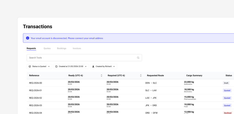
A key part of the redesign was rethinking how users should navigate the carrier application.

The existing product had strong functional areas, but the relationships between them were not always clear. I proposed a clearer lifecycle model:

This approach reduced duplicated-feeling records and made each area of the product more purposeful.

Icon

Transactions

The full overview of all commercial movements, showing the latest document or current stage in the transaction chain.

Icon

Transactions

The full overview of all commercial movements, showing the latest document or current stage in the transaction chain.

Icon

Requests

Request-stage work only, such as drafts, lost requests, and declined requests.

Icon

Requests

Request-stage work only, such as drafts, lost requests, and declined requests.

Icon

Quotes

Active sales activity, including saved quotes, quoted items, and quotes awaiting feedback.

Icon

Quotes

Active sales activity, including saved quotes, quoted items, and quotes awaiting feedback.

Icon

Bookings

Operationally relevant work, including draft, confirmed, and cancelled bookings.

Icon

Bookings

Operationally relevant work, including draft, confirmed, and cancelled bookings.

Icon

Invoices

Finance/admin records and billing progression.

Icon

Invoices

Finance/admin records and billing progression.

Icon

Contracts

Future legal/agreement workspace linked to the same transaction chain.

Icon

Contracts

Future legal/agreement workspace linked to the same transaction chain.

The redesign required a new design system that could support Aerios' increasing product complexity.

The system was built around reusable foundations, components, and product patterns rather than isolated screens.

The design system had to serve multiple goals:

01 Improve visual consistency

02 Speed up design work

03 Reduce front-end ambiguity

04 Improve QA reliability

05 Make new features easier to deliver

06 Support future enterprise workflows

07 Create a stronger foundation for accessibility

08 Make the product feel more polished and credible for enterprise customers

Image

UX Research

The first job was to reach out to users to understand what mattered most to them.
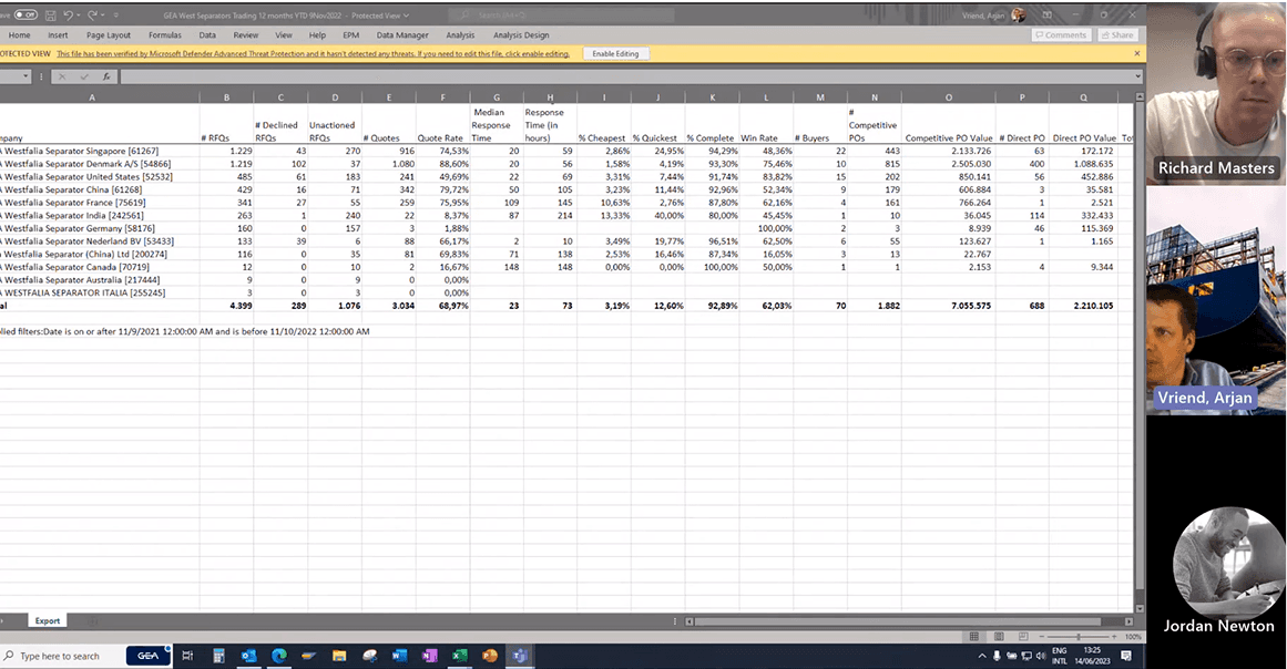
Exporting Data

Man Energy Solutions

“Data manipulation and exportation is important to us for capturing periods of time and internal circulation”
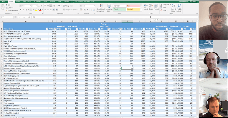
Storytelling

Caterpillar

“We use data for storytelling. Visualisation is very important to us as it creates a compelling story”
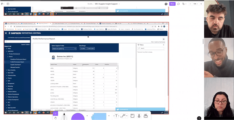
Understanding our Customers

Alfa Laval

“We want to understand who our best customers are, and also how that changes over the course of the year”
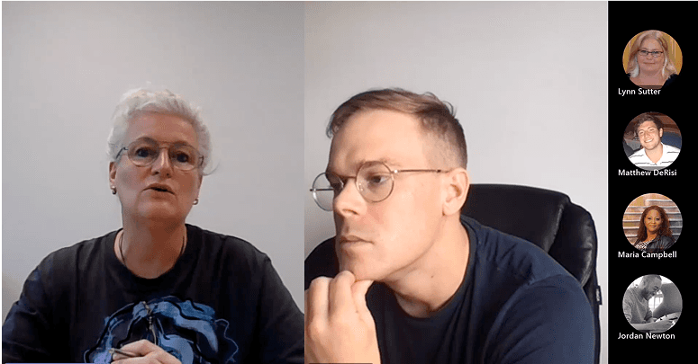
Comparing Time Periods

Kerger & Co.

“We see a lot of value in being able to compare months, quarters and years to identify trends in our performance.”
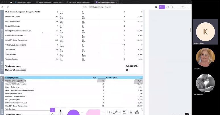
Performance Matters

Hamworthy

“Speed matters for us and so understanding our responsiveness and benchmarking it against our competitors is important.”
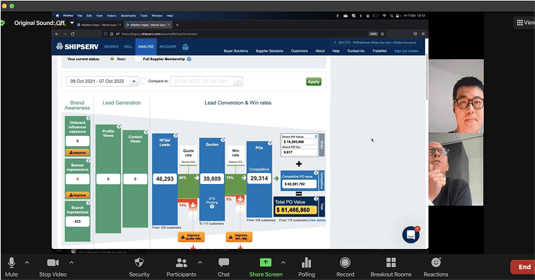
Break the Data Down

RS Components

“The data is more relevant when broken down by quote rate, number of quotes, and number of quotes per buyer.”

The foundation layer included:

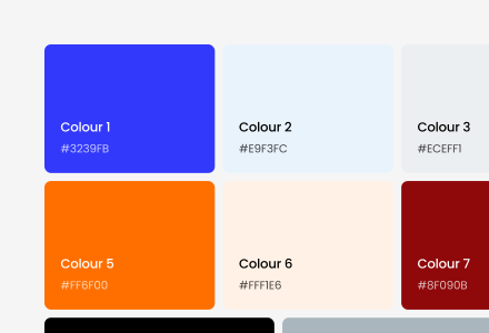
The aim was to move away from ad hoc colour usage and toward meaningful product semantics.

Colour

A semantic colour system was created to support:

Colour 1

#3239FB

Colour 2

#E9F3FC

Colour 3

#ECEFF1

Colour 4

#F7F8FA

Colour 5

#FF6F00

Colour 6

#FFF1E6

Colour 7

#8F090B

Colour 8

#FEF3F3

Colour 9

#000000

Colour 10

#AAB6BE

Colour 11

#FFFFFF

Typography

Typography was standardised to improve readability and hierarchy across dense product screens.

Defined styles included:

Size

Line high

Letter spacing

Type

00

00%

-00

Page titles

00

00%

-00

Section headings

00

00%

-00

Table headers

00

00%

-00

Body copy

00

00%

-00

Field labels

00

00%

-00

Helper text

00

00%

-00

Captions

00

00%

-00

Error messaging

00

00%

-00

Metadata

00

00%

-00

Empty state copy

Spacing

A spacing system was introduced to improve rhythm across forms, tables, cards, modals, and dashboards.

This was particularly important because the carrier application contains dense operational information where spacing needs to support scanning without wasting space.

Name

Name

0

0.5

1

2

3

4

5

6

8

10

Size (16px base)

Size

0rem

0.125rem

0.25rem

0.5rem

0.75rem

1rem

1.25rem

1.5rem

2rem

2.5rem

Pixels

Pixels

0px

2px

4px

8px

12px

16px

20px

24px

32px

40px

Spacing

Spacing

Layout

The system defined reusable layout patterns for:

Settings pages

Data tables

Detail pages

Summary headers

Modal workflows

Split layouts

Dashboard views

Quote Builder panels

Booking views

Related document sections

Interaction states

This was essential for a product dealing with complex workflows, provider integrations, formula overrides, and document states.

Component states were documented for:

01 Default

02 Hover

03 Focus

04 Active

05 Disabled

06 Loading

07 Error

08 Empty

09 Selected

10 Read-only

11 Overridden

12 Deleted

13 Stale data

14 Synced

15 Unsynced

Quote Image

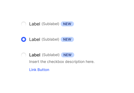
The new component system included reusable patterns for:

Each component was designed with clear variants, consistent naming, and reusable states.

Button
Component Image
Component Image
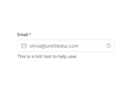
Inputs
Component Image
Component Image
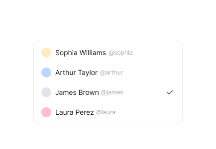
Select fields
Component Image
Component Image
Select fields
Component Image
Component Image
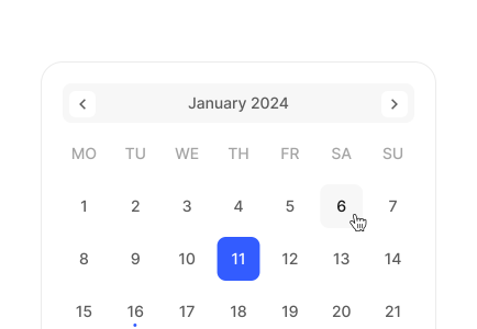
Date/time fields
Component Image
Component Image
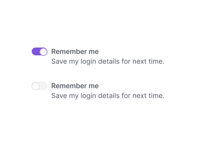
Toggles
Component Image
Component Image
Checkboxes
Component Image
Component Image
Radio groups
Component Image
Component Image

Because Aerios is a workflow-heavy B2B product, the design system could not stop at basic components. It needed product-specific patterns that could be reused across complex features.

This pattern allowed the product to scale toward enterprise integrations while keeping the settings experience consistent.

Transaction summary pattern

A reusable transaction header showing:

Unique transaction identifier

Customer/requester

RouteCurrent lifecycle stage

Current document

Status

Assigned team/user

Last updated timestamp

Related documents

Quote builder line pattern

A reusable transaction header showing:

Line name

Formula value

Manual override

Source data

Calculation state

Edit actions

Included/excluded state

Audit context

Related documents pattern

A reusable transaction header showing:

Original request

Related quotes

Related bookings

Related invoices

Future contracts

Team/Profile selector pattern

A reusable transaction header showing:

Team assignment

Default team

Multi-team users

Organisation-level profile settings

Request-level team storage

Integration status pattern

A reusable transaction header showing:

DocuSign

Adobe Acrobat Sign

RDC Aviation

AIMS

PPS

Flight planning providers

Currency conversion providers

Figma AI was used as an acceleration tool during exploration, not as a replacement for product thinking.

The key value was speed of exploration. Instead of spending several hours producing a single early wireframe direction, I could generate multiple structural options quickly, evaluate them against workflow requirements, then refine the strongest version using product judgement and design system components.

The process was:

01 Translate requirements into structured prompts

02 Generate early wireframe directions using Figma AI / First Draft

03 Compare multiple layout options quickly

04 Refine promising directions manually

05 Apply Aerios design system components

06 Convert screens into clickable prototypes

07 Use prototypes for stakeholder and user feedback

This helped speed up early concept exploration, especially for:

01 Settings architecture

02 Team/profile management

03 Transaction summary pages

04 Related document sections

05 Quote Builder line editing

06 Booking document flows

07 Integration configuration screens

08 Notification preference models

09 Contract generation flows

Example prompt structure

"Create a dense B2B SaaS settings page for an aviation charter platform. Include organisation-level team profiles, profile cards, add/edit/delete actions, default profile state, member assignment, and integration settings. Prioritise clarity, enterprise usability, and scalable configuration."

How AI was used responsibly

This positioned AI as a tool for accelerating senior design decision-making, rather than a shortcut around the design process.

AI was used for breadth, not final quality

Generated layouts were always reviewed against user needs and business logic

Final UI decisions were made manually

Design system components replaced generic AI-generated patterns

Interaction logic was validated with product and engineering

Prototypes were tested with users and stakeholders before delivery

I created clickable prototypes in Figma to test core workflows before engineering delivery.

Image
Prototype areas included:

01 Transaction summary page

02 Request-to-quote flow

03 Quote-to-booking progression

04 Related document navigation

05 Team/profile selection

06 Team settings management

07 Document generation from booking

08 Contract dispatch to DocuSign

09 Currency selection and conversion

10 Notification configuration

11 Quote line editing post-confirmation

12 Duplicate quote flow

13 Airport and en-route charge review flows

Image
The prototypes were designed to answer practical workflow questions:

01 Can users understand where a transaction currently sits?

02 Can users find the latest document quickly?

03 Can users move between related records without confusion?

04 Can users select the correct team/profile at request creation?

05 Can users edit quote lines after confirmation without feeling like they are reopening the whole quote?

06 Can users understand which cost values are system-derived versus manually overridden?

07 Can users configure integrations without needing technical support?

The testing strategy combined moderated usability testing, stakeholder walkthroughs, prototype review sessions, and behavioural analytics planning.

Testing methods

Moderated customer walkthroughs

Moderated customer walkthroughs

Task-based usability tests

Task-based usability tests

Internal product/engineering reviews

Internal product/engineering reviews

Prototype feedback sessions

Prototype feedback sessions

First-click testing

First-click testing

Navigation comprehension testing

Navigation comprehension testing

Form completion testing

Form completion testing

Table scanning tasks

Table scanning tasks

Preference testing for layout options

Preference testing for layout options

Heat map planning for post-release validation

Heat map planning for post-release validation

Example test tasks

Create a new request and select the correct team/profile

Create a new request and select the correct team/profile

Find all active quotes awaiting customer feedback

Find all active quotes awaiting customer feedback

Open a won quote and navigate to the related booking

Open a won quote and navigate to the related booking

Locate the original request from a booking

Locate the original request from a booking

Find the transaction identifier and explain what it links together

Find the transaction identifier and explain what it links together

Edit a quote line after the quote has been confirmed

Edit a quote line after the quote has been confirmed

Duplicate a quote and change a pricing assumption

Duplicate a quote and change a pricing assumption

Configure a document generation integration

Configure a document generation integration

Find where signed contracts would appear after DocuSign completion

Find where signed contracts would appear after DocuSign completion

Review airport or en-route charges returned by an external provider

Review airport or en-route charges returned by an external provider

To make the redesign measurable, I defined a metrics framework across usability, efficiency, adoption, and delivery.

Tools could include Microsoft Clarity, Hotjar, FullStory, or a similar analytics layer depending on implementation constraints.

Task success rate

Measured whether users could complete core workflows without assistance.

Target workflows:

Create request

Create request

Create quote

Create quote

Confirm booking

Confirm booking

Navigate related documents

Navigate related documents

Duplicate quote

Duplicate quote

Edit confirmed quote lines

Edit confirmed quote lines

Configure team/profile

Configure team/profile

Generate contract

Generate contract

Time on task

Measured whether redesigned workflows reduced the time required for high-frequency actions.

Key areas:

Time to create quote

Time to create quote

Time to find latest transaction stage

Time to find latest transaction stage

Time to navigate from quote to booking

Time to navigate from quote to booking

Time to locate related documents

Time to locate related documents

Time to configure a team/profile

Time to configure a team/profile

Time to update a confirmed booking document

Time to update a confirmed booking document

Error rate

Tracked where users made mistakes, abandoned steps, or selected the wrong record/status.

Example errors:

Opening the wrong document stage

Opening the wrong document stage

Selecting the wrong team/profile

Selecting the wrong team/profile

Missing required quote information

Missing required quote information

Misreading quote status

Misreading quote status

Editing the wrong quote line

Editing the wrong quote line

Failing to find related documents

Failing to find related documents

Click depth

Measured how many clicks were required to reach key areas.

Example:

From dashboard to latest transaction

From dashboard to latest transaction

From quote list to related booking

From quote list to related booking

From booking to original request

From booking to original request

From booking to related invoice

From booking to related invoice

From settings to team profile edit

From settings to team profile edit

First-click accuracy

Measured whether users clicked the expected area first when asked to complete a task.

This was particularly useful for testing:

Transaction summary navigation

Transaction summary navigation

Related documents

Related documents

Quote status behaviour

Quote status behaviour

Settings structure

Settings structure

Team/profile selection

Team/profile selection

System usability scale

Used as a high-level measure of perceived usability before and after redesign.

Target:

Achieve a clear improvement from baseline across commercial users.

Achieve a clear improvement from baseline across commercial users.

Customer effort score

Measured how easy users felt it was to complete core workflows.

Target areas:

Quote creation

Quote creation

Booking progression

Booking progression

Document generation

Document generation

Transaction navigation

Transaction navigation

Feature adoption

Measured whether redesigned workflows were actually used after release.

Target areas:

Percentage of requests created with team/profile selected

Percentage of requests created with team/profile selected

Percentage of quotes duplicated rather than rebuilt manually

Percentage of quotes duplicated rather than rebuilt manually

Percentage of bookings using related document navigation

Percentage of bookings using related document navigation

Usage of document generation flow

Usage of document generation flow

Use of quote line overrides post-confirmation

Use of quote line overrides post-confirmation

Design system adoption

Measured whether reusable components were being used consistently across new product work.

Example metrics:

Percentage of new screens built from design system components

Percentage of new screens built from design system components

Number of reusable components adopted

Number of reusable components adopted

Reduction in bespoke components

Reduction in bespoke components

Reduction in design QA issues

Reduction in design QA issues

Reduction in front-end rework

Reduction in front-end rework

Heat map and behavioural analytics

Planned heat map tracking to validate post-release behaviour across redesigned areas.

Tracked patterns:

Click concentration on key actions

Click concentration on key actions

Dead clicks

Dead clicks

Rage clicks

Rage clicks

Scroll depth

Scroll depth

Table interaction behaviour

Table interaction behaviour

Modal abandonment

Modal abandonment

Form field drop-off

Form field drop-off

Repeated back-and-forth navigation

Repeated back-and-forth navigation

Unused navigation items

Unused navigation items

The heat map strategy was designed around the highest-risk workflows.

Workflow Image
Transaction summary page

Metrics to track:

Do users open the latest document or search manually?

Do users open the latest document or search manually?

Are users using the transaction identifier?

Are users using the transaction identifier?

Are status and lifecycle stage clear?

Are status and lifecycle stage clear?

Are users relying on filters or scanning the table?

Are users relying on filters or scanning the table?

Workflow efficiency

Questions to answer:

Which pricing lines are edited most often?

Which pricing lines are edited most often?

Are users finding formula overrides?

Are users finding formula overrides?

Are users adding custom lines?

Are users adding custom lines?

Are users interacting with source/override indicators?

Are users interacting with source/override indicators?

Booking view

Questions to answer:

Do users use related document sections?

Do users use related document sections?

Can users find the original request and related quotes?

Can users find the original request and related quotes?

Are users attempting to edit quote lines post-confirmation?

Are users attempting to edit quote lines post-confirmation?

Are users confused by document status?

Are users confused by document status?

Settings

Questions to answer:

Can admins find team/profile settings?

Can admins find team/profile settings?

Are users able to add members without hesitation?

Are users able to add members without hesitation?

Are users finding integration configuration?

Are users finding integration configuration?

Are users getting stuck in modals?

Are users getting stuck in modals?

A key part of my role was translating messy customer needs into deliverable product requirements.

I used a structured requirements process:
Gate 1

Focused on:

01 Change overview

02 Who the change is for

03 Why the change is desirable

04 User/business value

05 Problem framing

Gate 2

Focused on:

01 High-level specification points

02 Expected behaviours

03 Design requirements

04 Customer feedback

05 Risks and dependencies

06 Time estimates

07 Delivery considerations
Product Image
Product Image
Quote Icon
Quote Icon

"This app has totally helped me take charge of my budget! The tips and alerts keep me from overspending and help me save more every month."

User Image

Marco Diaz

Marco Diaz

CUO of Aerios

CUO of Aerios

This created clearer alignment between customer needs, product decisions, design exploration, and engineering implementation.
Examples of requirements shaped through this process included:

01 Configurable team profiles

02 Transaction summary page

04 Quote duplication

05 Editable quote lines post-confirmation

06 Document generation and DocuSign integration

07 Currency conversion

08 Notifications

09 RDC airport and en-route charge integration

10 AIMS operational/fleet integration

11 Request/quote/booking lifecycle navigation

Key design decisions

Move toward a single transaction model

Rather than treating Requests, Quotes, Bookings, Invoices, and Contracts as disconnected objects, the redesign introduced the concept of one commercial transaction with multiple related documents.

This improved:

Traceability

Traceability

Navigation

Navigation

Auditability

Auditability

User confidence

User confidence

Future reporting potential

Future reporting potential

Keep workflow tabs purposeful

Each tab was given a clearer job:

Requests: request-stage work

Quotes: active sales work

Bookings: operational work

Invoices: finance/admin work

Transactions: full lifecycle overview

Contracts: future legal/agreement work

Use design system patterns for scale

Rather than designing one-off screens, reusable patterns were created for settings, tables, modals, transaction headers, related documents, quote lines, and integration states.

Design for enterprise configuration

The product needed to support larger carrier organisations with different teams, quote templates, formulas, aircraft, base airports, document behaviours, and settings within one tenant.

Preserve flexibility in Quote Builder

Users needed control over quote lines, formulas, custom lines, overrides, and post-confirmation edits. The redesign supported this without making the workflow feel uncontrolled.

Before and after narrative

Before

Screens felt powerful but inconsistent

Screens felt powerful but inconsistent

Navigation between related records was not always clear

Navigation between related records was not always clear

Quotes, bookings, and invoices could feel disconnected

Quotes, bookings, and invoices could feel disconnected

Similar UI patterns were rebuilt repeatedly

Similar UI patterns were rebuilt repeatedly

Users sometimes saw records that had moved beyond the relevant stage

Users sometimes saw records that had moved beyond the relevant stage

Settings were becoming harder to scale

Settings were becoming harder to scale

New features added complexity rather than reducing it

New features added complexity rather than reducing it

After

Screens felt powerful but inconsistent

Screens felt powerful but inconsistent

Navigation between related records was not always clear

Navigation between related records was not always clear

Quotes, bookings, and invoices could feel disconnected

Quotes, bookings, and invoices could feel disconnected

Similar UI patterns were rebuilt repeatedly

Similar UI patterns were rebuilt repeatedly

Users sometimes saw records that had moved beyond the relevant stage

Users sometimes saw records that had moved beyond the relevant stage

Settings were becoming harder to scale

Settings were becoming harder to scale

New features added complexity rather than reducing it

New features added complexity rather than reducing it

The redesign created value across product, commercial, engineering, and customer success.

For customers

Clearer workflows

Clearer workflows

Faster quote and booking management

Faster quote and booking management

Less confusion between document stages

Less confusion between document stages

Better visibility of related records

Better visibility of related records

More confidence in complex quote workflows

More confidence in complex quote workflows

More scalable configuration for larger teams

More scalable configuration for larger teams

For product

Stronger product architecture

Stronger product architecture

Clearer requirements process

Clearer requirements process

Better prioritisation of enterprise needs

Better prioritisation of enterprise needs

Reusable patterns for future roadmap items

Reusable patterns for future roadmap items

Improved ability to validate concepts before build

Improved ability to validate concepts before build

For engineering

Reduced UI ambiguity

Reduced UI ambiguity

More reusable component patterns

More reusable component patterns

Clearer handoff

Clearer handoff

Fewer bespoke screen behaviours

Fewer bespoke screen behaviours

Easier QA through standardised states

Easier QA through standardised states

For the business

Stronger enterprise readiness

Stronger enterprise readiness

Faster feature delivery

Faster feature delivery

Better support for customer-specific workflows

Better support for customer-specific workflows

Improved ability to sell a polished, scalable product

Improved ability to sell a polished, scalable product

Stronger foundation for marketplace, requester-side, and transaction-led growth

Stronger foundation for marketplace, requester-side, and transaction-led growth

Because this redesign was tied to both product delivery and customer adoption, I defined a measurement plan across four levels.

Delivery efficiency

Metrics to track:

Design cycle time

Design cycle time

Development cycle time

Development cycle time

Number of reusable components used

Number of reusable components used

Front-end rework

Front-end rework

QA defects related to UI inconsistency

QA defects related to UI inconsistency

Time from requirement to prototype

Time from requirement to prototype

Time from prototype to delivery

Time from prototype to delivery

Workflow efficiency

Questions to answer:

Quote creation time

Quote creation time

Time to locate latest transaction stage

Time to locate latest transaction stage

Time to move from quote to booking

Time to move from quote to booking

Time to find related documents

Time to find related documents

Time to configure a team/profile settings

Time to configure a team/profile settings

Time to generate a contract

Time to generate a contract

User behaviour

Questions to answer:

Click depth

Click depth

First-click accuracy

First-click accuracy

Drop-off points

Drop-off points

Dead clicks

Dead clicks

Rage clicks

Rage clicks

Modal abandonment

Modal abandonment

Feature adoption

Feature adoption

Search usage

Search usage

Filter usage

Filter usage

Commercial outcomes

Questions to answer:

Quote turnaround time

Quote turnaround time

Quote-to-booking conversion

Quote-to-booking conversion

Number of quotes created per user

Number of quotes created per user

Number of booking progressions

Number of booking progressions

Document generation usage

Document generation usage

Contract send/completion rate

Contract send/completion rate

Customer adoption by tenant

Customer adoption by tenant

Reduction in support questions around navigation or document status

Reduction in support questions around navigation or document status

What I would show visually

Hero section

Large product screenshot of redesigned carrier dashboard or transaction page

Large product screenshot of redesigned carrier dashboard or transaction page

3 to 4 metric cards

3 to 4 metric cards

Short summary of role and impact

Short summary of role and impact

What I would show visually

Problem section

Before screenshots showing inconsistent screens

Before screenshots showing inconsistent screens

Annotated UX audit findings

3 to 4 metric cards

Annotated UX audit findings

Diagram of fragmented workflow

Short summary of role and impact

Diagram of fragmented workflow

Discovery section

Customer/stakeholder input map

Customer/stakeholder input map

Requirement themes

3 to 4 metric cards

Requirement themes

Workflow map from request to invoice

Short summary of role and impact

Workflow map from request to invoice

What I would show visually

Design system section

Tokens

Tokens

Typography

3 to 4 metric cards

Typography

Colours

Short summary of role and impact

Colours

Components

Short summary of role and impact

Components

Table patterns

Short summary of role and impact

Table patterns

Modal patterns

Short summary of role and impact

Modal patterns

Quote Builder patterns

Short summary of role and impact

Quote Builder patterns

Settings tiles

Short summary of role and impact

Settings tiles

AI prototyping section

Prompt examples

Prompt examples

AI-generated low-fi directions

3 to 4 metric cards

AI-generated low-fi directions

Refined wireframes

Short summary of role and impact

Refined wireframes

Final design system version

Short summary of role and impact

Final design system version

What I would show visually

Testing section

Task list

Task list

Usability metrics

3 to 4 metric cards

Usability metrics

Heat map examples or planned tracking

Short summary of role and impact

Heat map examples or planned tracking

Before/after task flow comparison

Short summary of role and impact

Before/after task flow comparison

Final solution section

Transaction summary page

Transaction summary page

Quote Builder

3 to 4 metric cards

Quote Builder

Booking view

Short summary of role and impact

Booking view

Related documents

Short summary of role and impact

Related documents

Team/profile settings

Short summary of role and impact

Team/profile settings

Document generation

Short summary of role and impact

Document generation

Notifications/currency concepts

Short summary of role and impact

Notifications/currency concepts

What I would show visually

Results section

Impact metrics

Impact metrics

Delivery improvements

3 to 4 metric cards

Delivery improvements

Product scalability outcomes

Short summary of role and impact

Product scalability outcomes

Reflection on leadership decisions

Short summary of role and impact

Reflection on leadership decisions

Final case study summary

I led the redesign of the Aerios carrier application to transform a fast-growing aviation product into a more scalable, consistent, and enterprise-ready platform.

The work combined product strategy, customer discovery, UX audit, design system creation, AI-assisted rapid prototyping, user testing, and delivery alignment. The result was not just a cleaner interface, but a stronger product foundation for complex commercial workflows across requests, quotes, bookings, invoices, contracts, integrations, and team-based configuration.

By introducing a new design system and clearer transaction model, I helped Aerios move toward a product experience that was easier to use, faster to build, and better aligned to how aviation commercial teams actually work.

This project demonstrates my ability to operate at director level across product strategy, design systems, user research, complex B2B workflows, stakeholder alignment, and measurable business outcomes.

I’d Love to Hear
Your Ideas.
Let’s Connect!

Richard Masters

I’d Love to Hear
Your Ideas.
Let’s Connect!

Richard Masters

I’d Love to Hear
Your Ideas.
Let’s Connect!

Richard Masters

I’d Love to Hear
Your Ideas.
Let’s Connect!

Richard Masters