
Eleven status labels can still leave a team waiting, finished-ish and none the wiser. Nobody could explain what had been processed, by whom, or whether processing was a good thing. The interface displayed each status in a beautifully consistent coloured pill. The confusion was immaculate.
This is what happens when teams treat status as decoration. A label begins as a database value, arrives in the interface wearing a tasteful background colour, and quietly becomes the way an organisation understands its work. Users build decisions around it. Reports depend on it. Notifications fire from it. Managers ask why too many things are stuck in it. Before long, a six-letter word is carrying half the operating model.
Status design is therefore not a content tidy-up. It is product modelling.
A label is a promise
When a product says a request is “Approved”, users reasonably assume something has happened. A qualified person reviewed it. The required checks passed. The next action is now possible. If “Approved” merely means somebody clicked a button, the label overstates reality.
Every status makes a promise about state. It should tell users what is true now, not simply what happened most recently. “Email sent” describes an event. “Awaiting customer response” describes the situation. The second is usually more useful because it supports a decision: wait, follow up or escalate.
The distinction sounds small until a workflow crosses teams. Sales may think “Booked” means the customer has committed. Operations may think it means a flight record exists. Finance may think it means an approved contract is available. Everyone uses the same word and enjoys the efficiency of misunderstanding each other faster.
Start with state, not vocabulary
I avoid beginning status work with a list of names. I start with the object moving through the system: a request, quote, contract, order or invoice. What is true about it at each meaningful point? What has become possible? What is no longer allowed? Who is responsible for the next move?
Those questions expose whether two apparently different statuses are actually the same state, or whether one broad status is concealing several operationally important conditions. They also prevent the common mistake of copying internal department language directly into a customer-facing experience.
In the Aerios carrier marketplace work, statuses sat inside a wider charter lifecycle. A request could move through quoting, negotiation, contracting, approval, booking and invoicing. The useful model was not a celebratory rainbow of pills. It was a shared understanding of what had happened, what remained outstanding and which team could act.
Events and states are different things
An event happens at a point in time. A state remains true until something changes it. Products often confuse the two because event logs are easy to generate. “Document uploaded”, “quote viewed” and “approval requested” are useful history, but they do not necessarily describe the current situation.
A robust interface may show both. The status says “Awaiting finance approval”. The history says who requested approval and when. This allows users to understand the present without losing the evidence behind it.
The Nielsen Norman Group heuristic on visibility of system status remains relevant because users need timely, understandable feedback about what the system is doing. A spinner that ends in “Done” is feedback. A state that remains meaningful when someone returns two days later is product design.
Design the transitions
A status model is only half finished when the labels have been agreed. The transitions matter just as much. What moves an item from Draft to Submitted? Can it return? Does an approval lock commercial data? What happens if the customer changes the request after approval? Can two systems update the same record?
Transitions are where business rules become visible. They also reveal the awkward cases that workshops prefer to leave until somebody says “we can handle that manually”. Manual handling is sometimes reasonable. Invisible manual handling is not. If a person must intervene, the product should show that intervention as part of the workflow rather than pretending automation is thinking very hard.
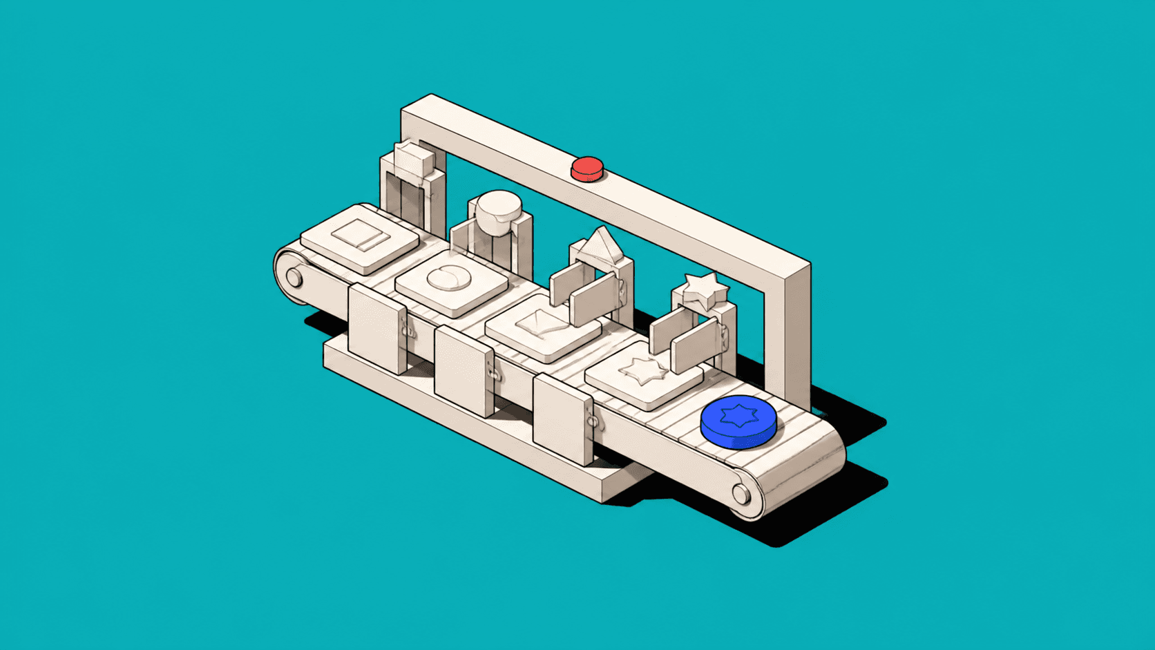
I like to describe each transition using four parts: trigger, conditions, effect and owner. The trigger is what starts it. Conditions are what must be true. The effect describes what changes. The owner is the person or system responsible. This simple structure turns vague arrows into something a multidisciplinary team can test.
Waiting is a real state
Teams often design active statuses and neglect waiting. Yet many operational products spend most of their life waiting: for a customer, another department, an integration, a payment or a scheduled time.
“Pending” is rarely enough. Pending what? Since when? Who owns the follow-up? Is there a deadline? A useful waiting state exposes the dependency and the recovery path. “Awaiting signed contract — customer action — due Friday” may not win a copywriting award, but it lets somebody manage the work.
Waiting states also make measurement more honest. If an item sits untouched for four days because the product does not reveal who owns it, that is not simply user delay. It is workflow friction. Teams can track time in state, overdue volume and repeated reversals to find where the operating model is struggling.
Colour cannot carry the meaning
Status colours are helpful when they reinforce meaning, but colour should never be the only signal. Accessibility is one reason; operational ambiguity is another. Red might mean error, overdue, rejected or merely urgent. Green might mean paid, approved, complete or safe to proceed. Those are different conditions.
Use clear labels, supporting text where necessary and icons only when they add recognisable meaning. The WCAG guidance on use of colour states that colour should not be the sole means of conveying information. That is sound accessibility practice and an excellent defence against status interfaces that resemble a packet of highlighters after a difficult afternoon.
Status should support action
The best status answers “what now?” A quote marked Draft should offer the actions appropriate to a draft. A contract awaiting signature should make the signatory and reminder route visible. A rejected approval should preserve the reason and allow correction without forcing the user to reconstruct the work.
This is why status belongs close to actions and context, not buried in a table column. In a dense workflow, the same label may need a compact presentation in a list and a fuller explanation in the record. Consistency means preserving the same underlying truth, not forcing every surface to use the same number of pixels.
Measure the model, not the colours
After introducing a new status model, I look for operational signals. Are users asking fewer “where is this?” questions? Has time in ambiguous states fallen? Are handovers clearer? Do fewer records jump backwards because a required condition was missing? Can support teams explain the lifecycle without a private translation guide?
These measures reveal whether the model helps people coordinate. A perfect label cannot repair a broken process, but a clear model makes the break visible enough to address.
Make the workflow discussable
Status is the compressed language of a product. It tells people what the system believes, what the organisation has agreed and what can happen next. If that language is vague, the interface spreads uncertainty at scale.
So treat each label as a promise. Separate events from states. Define transitions. Give waiting the dignity of specificity. Use colour as support, not meaning. Most importantly, connect every state to responsibility and action.
If nobody can explain what “Processed” means, resist the temptation to choose a nicer shade of purple. The product is asking for a model, not a makeover.

