

Project Result
Reduction in time to close offers
AI recommendation acceptance rate
Avg. value protected per deal
Problem Statement
Contract negotiation was slow, inconsistent, and rarely documented in its reasoning. Two people working on similar deals could end up agreeing to very different terms, because each was relying on memory and feel instead of what the company had actually agreed to before.
That inconsistency had a cost. Liability caps were conceded without checking what similar deals had held. ESG clauses were dropped under time pressure without anyone pricing the impact. Discounts were accepted outside what the market had already proven achievable.
The project was to build an AI-assisted negotiation tool that could reason from past deals, produce a position a human could trust and interrogate, and know when to hand control back.
Goals and Objectives
Evidence Over Instinct
Every recommendation the system makes should be traceable to a comparable deal, not to a general sense of "market rate.
Bounded Autonomy
The system should be able to negotiate inside a defined mandate, but must never have the authority to concede terms beyond it.
Legible Trade-offs
Every commercial concession should be presented with a range and a confidence level, not a single misleadingly precise number.
Escalation as a Feature
When a negotiation exceeds its risk tolerance, handing back to a human should read as the system working correctly, not failing.
Requirements Gathering
Early discovery sessions with procurement leads, legal counsel, and category managers surfaced three consistent frustrations:
REQUIREMENT
Working System
Negotiators were willing to accept an AI-generated position, but only if they could see the comparable deals and the assumptions behind it. A black-box recommendation was a non-starter for legal sign-off.
REQUIREMENT
Clear Lines of Authority
Procurement and legal both needed certainty about what the system could and could not agree to on its own, and exactly what would trigger a pause for human review.
REQUIREMENT
Auditability
Every negotiation needed to produce a defensible record — what was assumed, what evidence supported it, and why a given position was taken — for later audit and for training new negotiators.
Logic Map
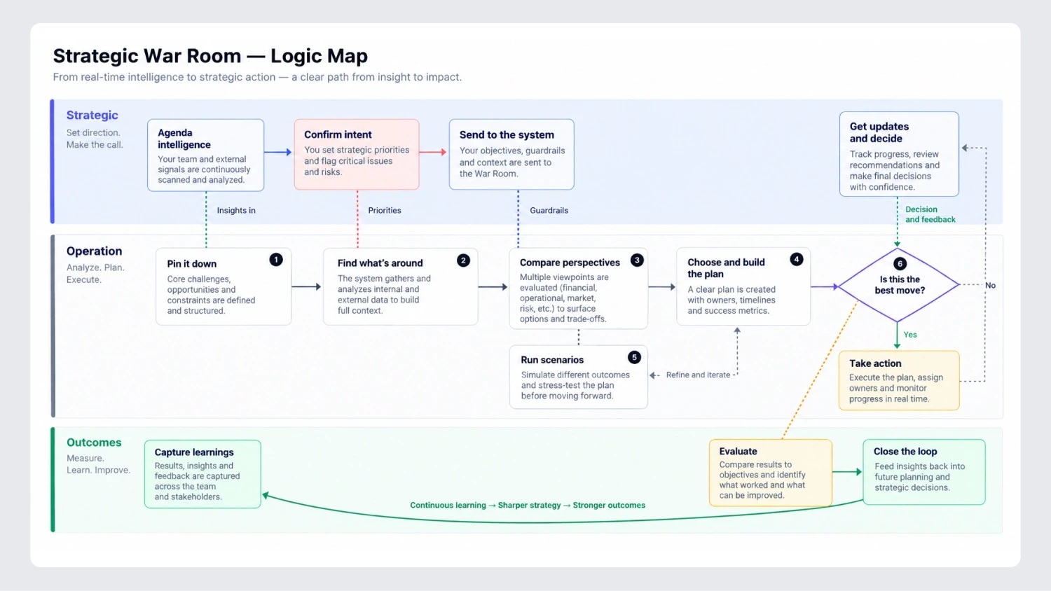
The decision journey was mapped in its entirety, starting from the point where the agent makes decisions independently based on Sarah’s mandate, through the process whereby a certain disagreement – say, about a discount, liability, or ESG consideration – lies outside the mandate and goes to her, all the way through her decision and justification for it.
This mapping continued beyond the decision-making process to cover what follows after it, namely the logging of the result in terms of who made the decision, what was used, and why, and its addition to the Contract Memory.
Personas
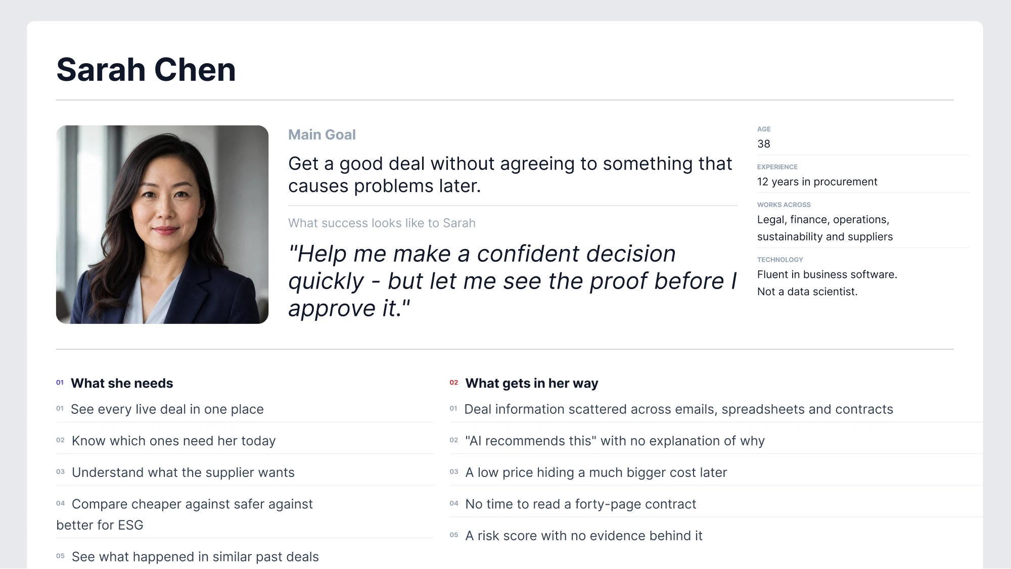
To make sure the design decisions that followed were grounded in a real user rather than an assumption, we asked the client for information about who the main users of the negotiation agent actually were. Using that input, we built a persona “Sarah Chen” so the team could get a clearer picture of the primary user: her goals, her frustrations, and what she actually needed in the moment a negotiation stalled and landed on her desk.
Full Wireframe
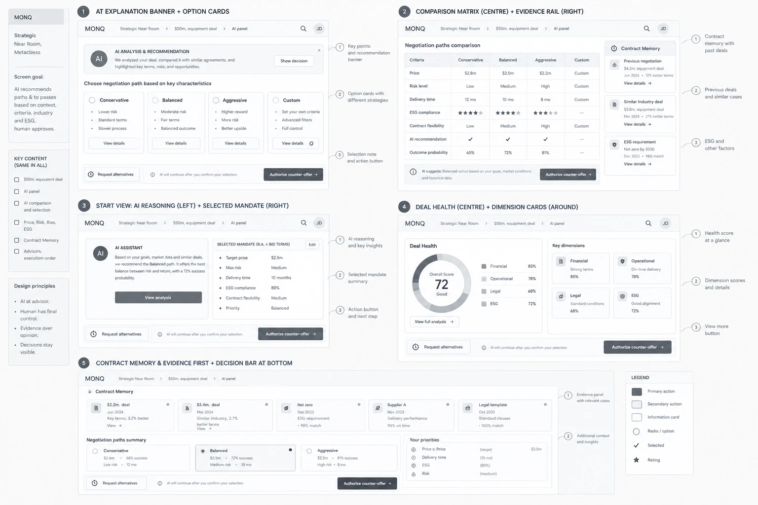
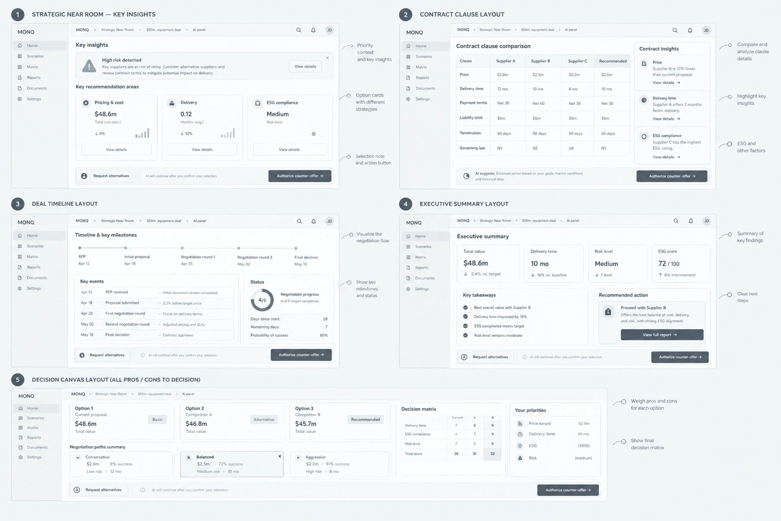
Before using working on UI, I drew out the key screens using pen and paper, outlining the mandate, the reasoning process, and the escalation process – allowing the logic of the interface to be tested quickly and cheaply without spending hours developing visuals that would then need to be thrown away.
Tools Used
The toolset used was geared towards multiple rounds of low-fidelity iteration, along with qualitative and quantitative data gathering and analysis.

Miro
Miro was chosen as a tool to ideate, collaborate with stakeholders and create lo-fi art initially.
Easy to collaborate
Non-visual
Perfect for user-flow diagrams

Figma
Figma is a go-to tool for development-ready design and annotations.
Component-based architecture
Design and Prototyping
Easy developer handoffs

Google Analytics
Google Analytics was used to track user behavior, measure performance and guide data-driven decisions.
Comprehensive user tracking
Bespoke trend tracking
Easy to integrate with data visualisation tools like Power BI
Claude AI
Claude AI was used to support the ideation, refine design decisions and accelerate web app design.
UX/UI Ideation and exploration
Design Feedback abd refinement
Faster content and interaction design
Designing the Interface
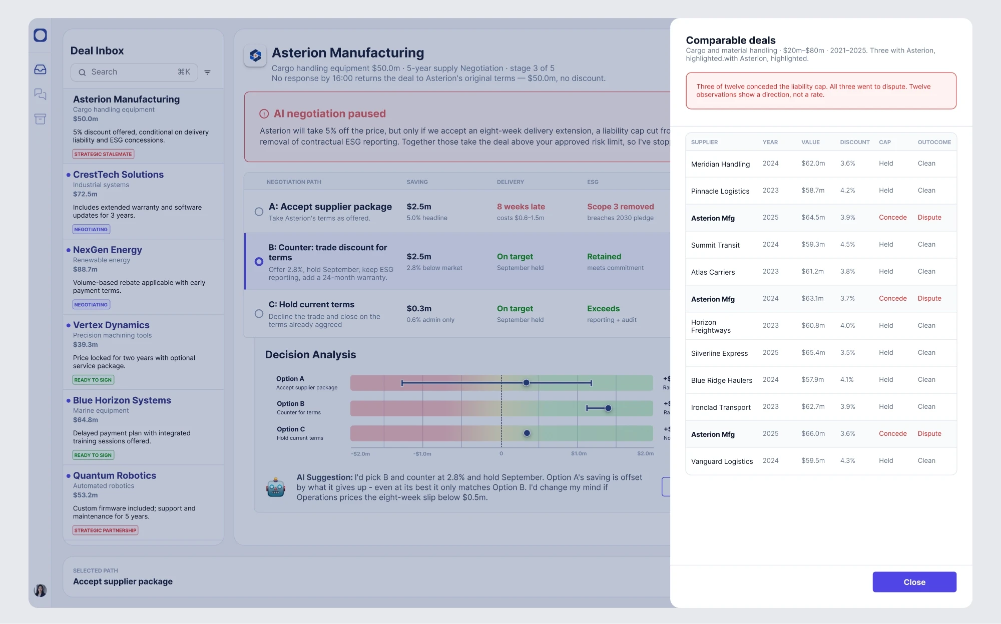
Based on feedback on low-fidelity wireframe, we came to this design.

UI DESIGN
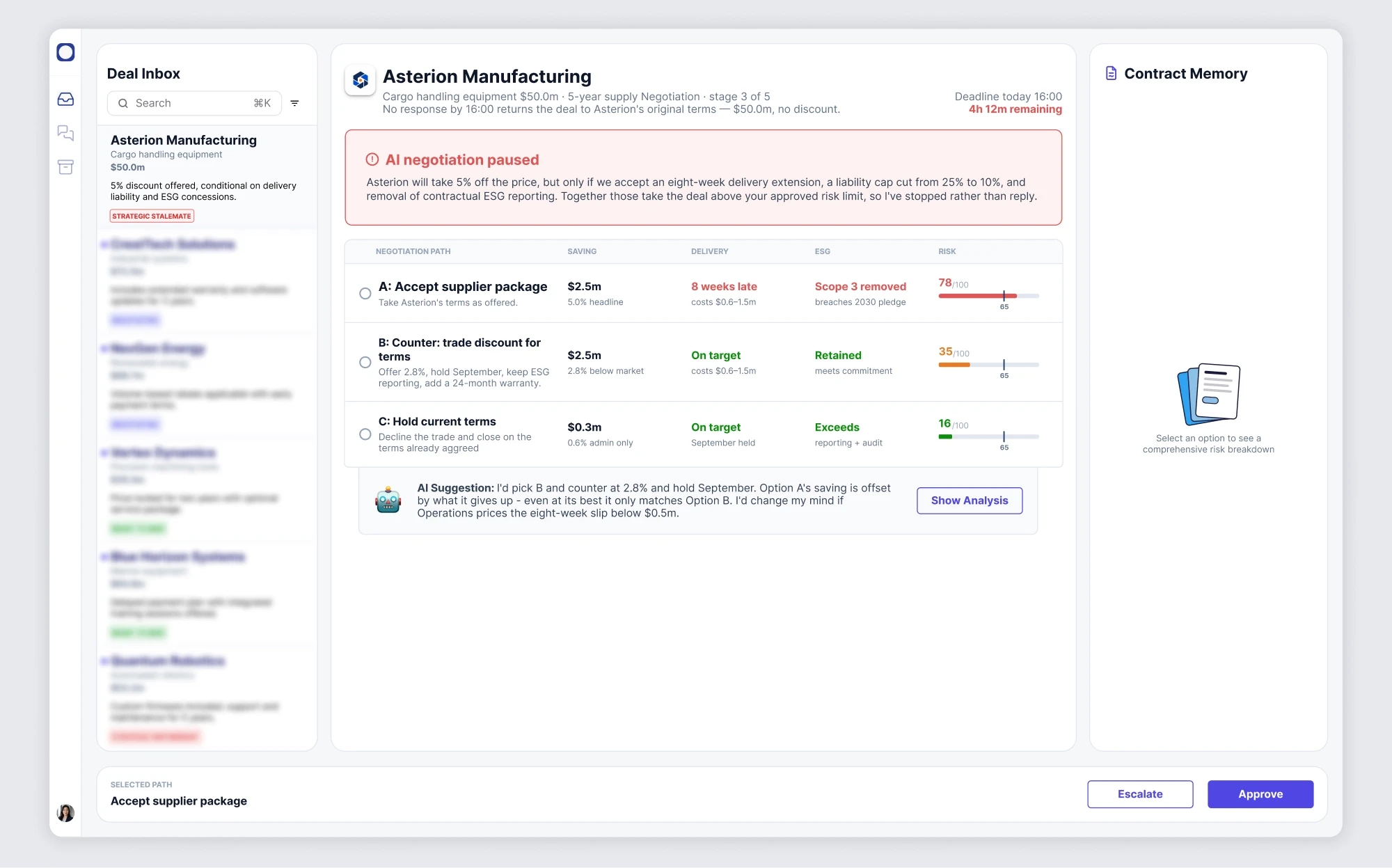
Viewing different negotiation pathways
Comparing options side by side reduces automation bias, the tendency to over-trust whichever answer is shown first.
Each pathway uses identical cards and field order, so no option is visually favored before the user evaluates it. The risk indicator sits last in each row, matching natural reading flow, since it's the variable most likely to change the decision.
UI DESIGN
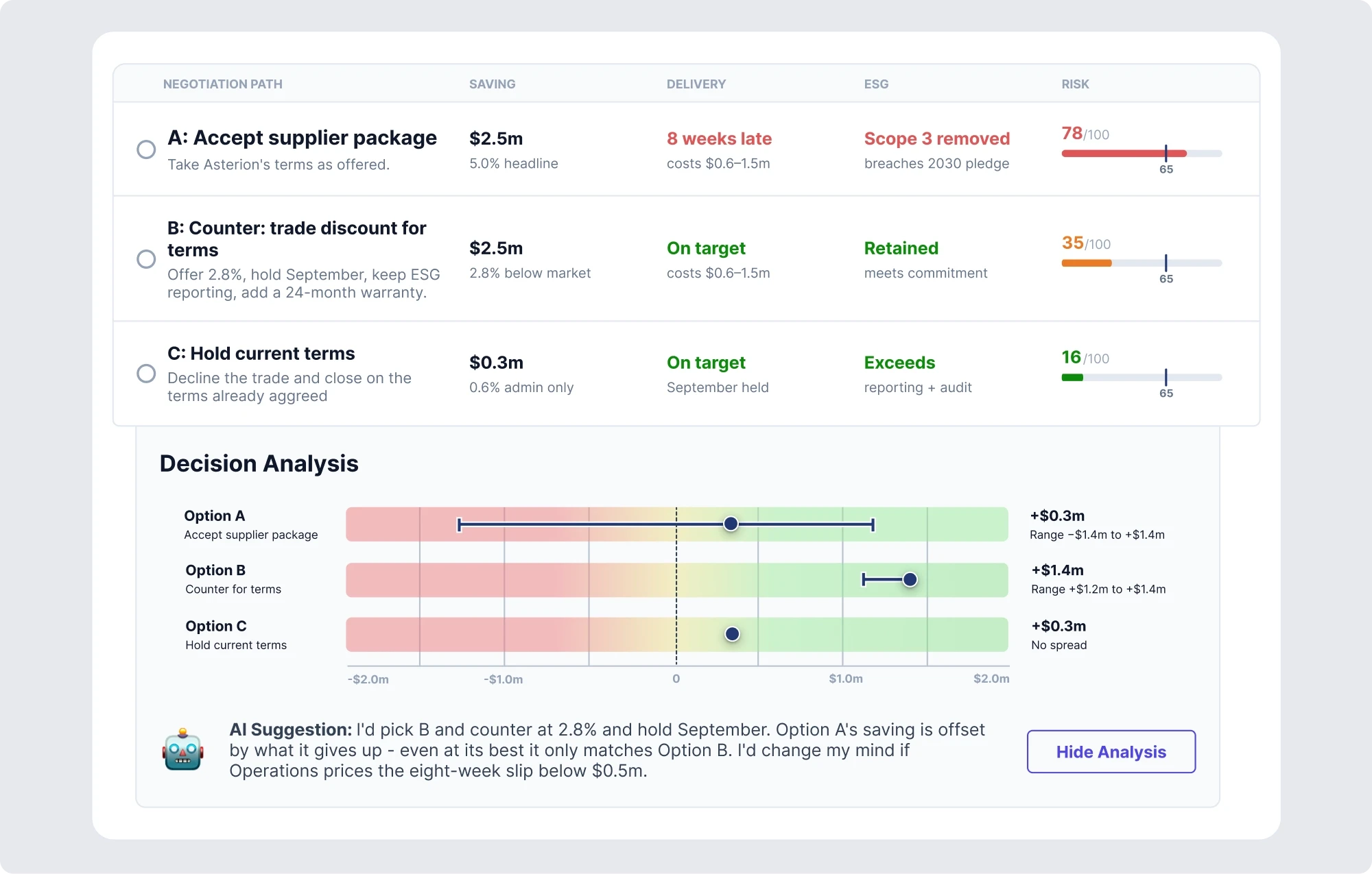
AI Suggestion and analysis
"One number" suggests false certainty. By presenting options as a range along a common scale, uncertainty becomes explicit and it can be quickly evaluated whether the decision is a close one or a definite one.
The explanatory text below it serves to be an explanation; the graph tells what the reason tells why.
UI DESIGN
Compare your deals
Any AI-generated recommendation carries a verification cost, the user has to decide whether to accept it or dig for evidence.
We decided to present relevant deals consistently as an always-visible panel, instead of requiring a second click to find them, reduces the cost of context-switching from the conclusion back to the evidence, since evidence and conclusion remain together in one’s visual field.
Design Guide for Consistency
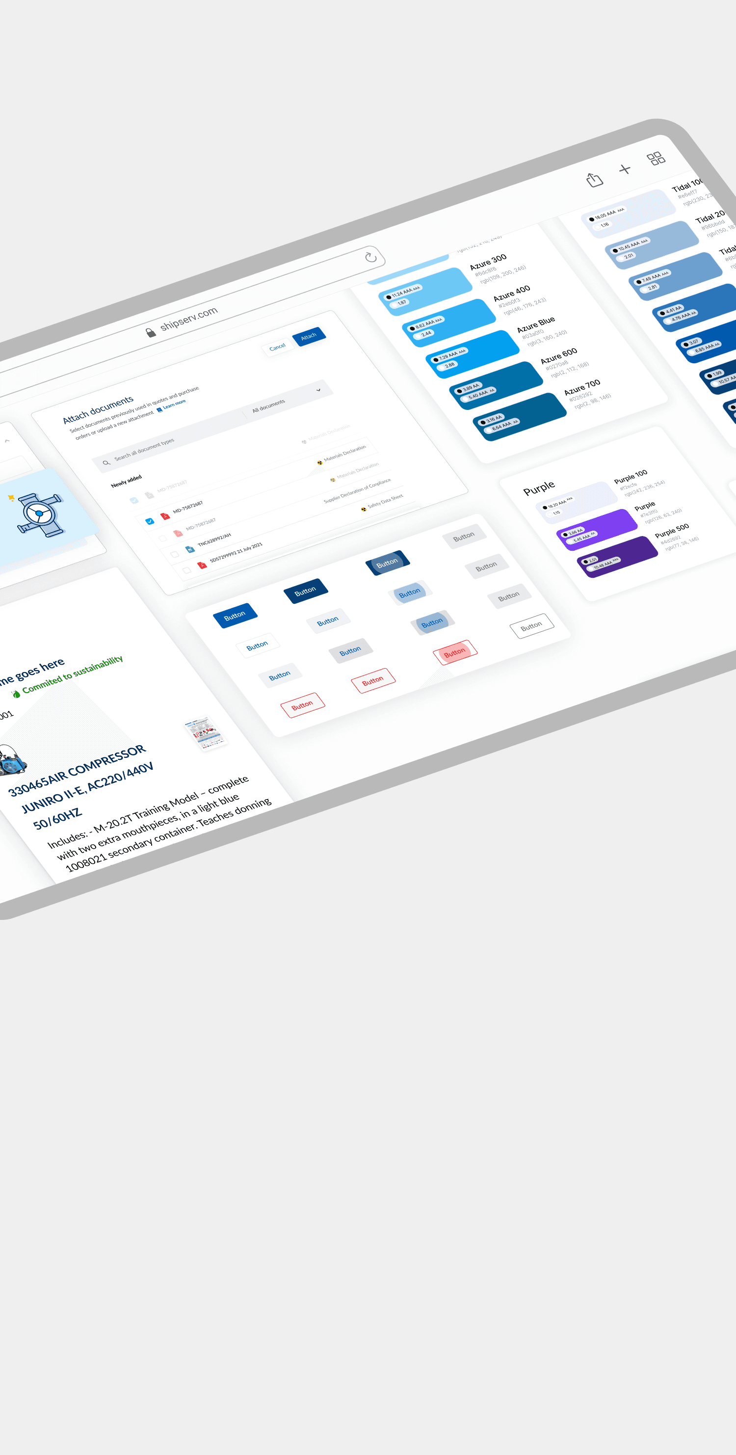
Before designing the screens, a guide with typography, buttons, colors, and interface components was created and was constantly updated throughout the process.
Color Palette
Defining a consistent color system that supports hierarchy, accessibility, branding, and clear visual feedback.

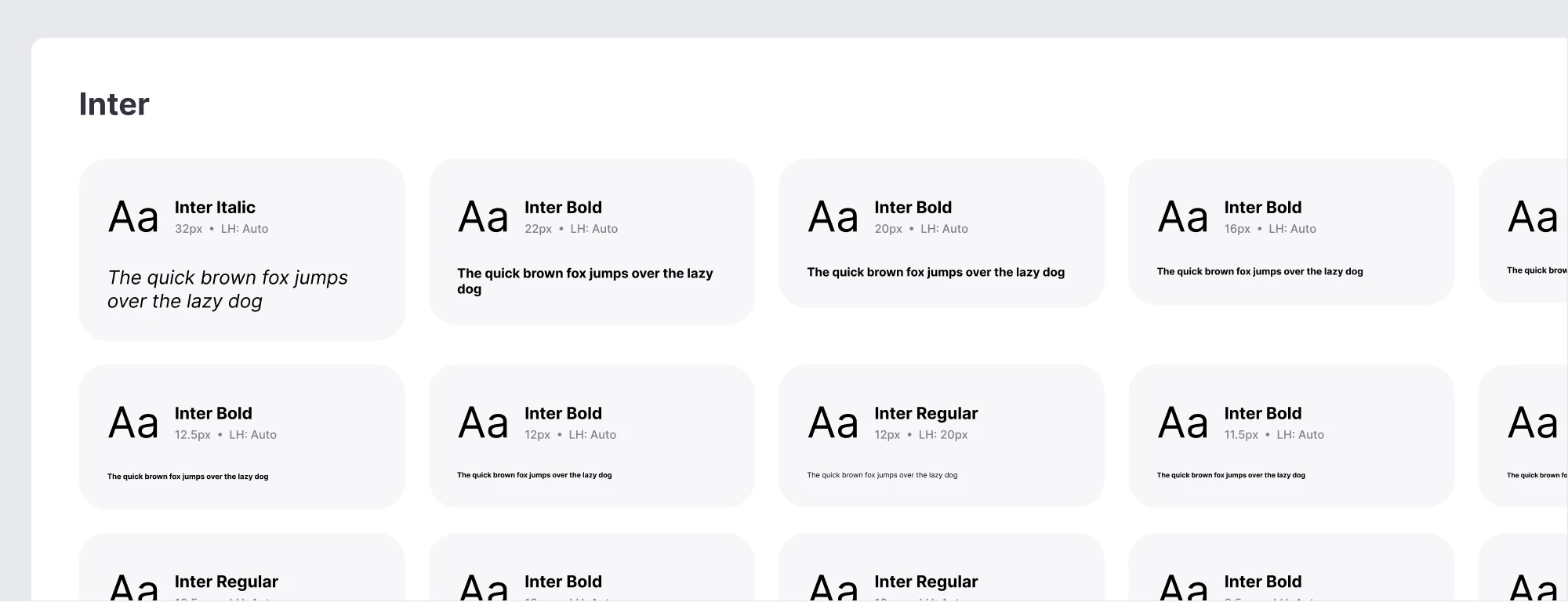
Typography
Clear type hierarchy to improve readability, consistency, and content structure across the product.
Buttons
Consistent button styles and states to make actions clear, predictable, and easy to interact with.

Checkbox, radio button & badge
Designing small UI components for selections, status indicators, and contextual information w.

Other components
Many other reusable UI components and patterns to ensure consistency, scalability, and faster product development.

Conclusion
Across the pilot, negotiations completed 38% faster than the historical baseline, with 92% resolved within the agreed mandate and no escalation needed.
When escalation did happen, reviewers had enough context from the reasoning trail to make quick, confident decisions without starting the analysis from scratch.
The biggest change, however, was in how people viewed the system. A pause was no longer seen as a limitation, but as a useful signal, showing that the AI knew when something was outside its boundaries.