

Project Result
Problem Statement
Goals and Objectives
Consistency in Design
The primary objective was to establish a unified design system that would ensure consistency, improve collaboration, and accelerate the design and development.
Proper Documentation
Providing proper documentation support for the Designers, Engineers, Developers, Product Managers, and other stakeholders.
Design and Development
Ensure accessibility and inclusivity by adhering to WCAG design standards and conducting thorough QA on components.
Maintaining WCAG and QA
Selecting proper tools for design and development in order to improve collaboration.
Auditing the Existing Design Elements
This research helped us identify key areas of improvement and set the foundation for our design system. we identified common design patterns and discrepancies across products.

DESIGN AUDIT
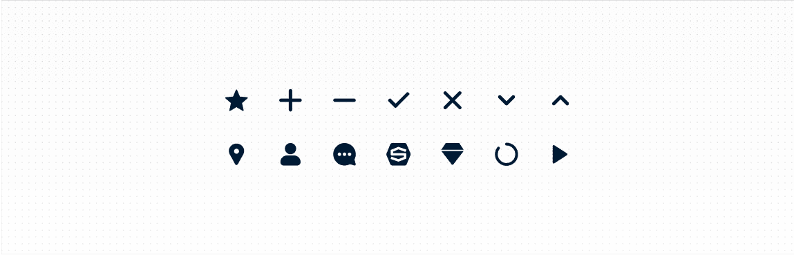
Iconography Issues
Icon Sizes and Colors: Inconsistent sizes and colors for icons, which made the interface appear unprofessional and inconsistent.
DESIGN AUDIT
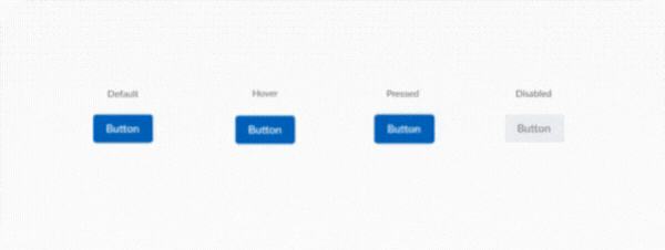
Inconsistent Button Styling
Colors and Sizes: Different elements using varying shades of primary colors and inconsistent button sizes, leading to a fragmented look.
Borders and Shadows: Some buttons having borders and shadows while others do not, causing a lack of uniformity.
DESIGN AUDIT
Typography Variations
Font Families: Different elements using multiple font families instead of a standardized set, creating a disjointed experience.
Line Heights and Spacing: Inconsistent line heights and spacing in text elements, affecting readability and visual harmony.

DESIGN AUDIT
Form Element Discrepancies
Input Field Styles: Variation in padding, border colors, and focus states across different forms, making the user experience inconsistent.
Error Messaging: Different styles and placements for error messages, leading to confusion.

DESIGN AUDIT
Card Layout Differences
Padding and Margins: Variations in padding and margins in cards, causing uneven spacing and alignment issues.
Content Hierarchy: Inconsistent use of headings and text styles within cards, impacting the clarity and visual flow of information.
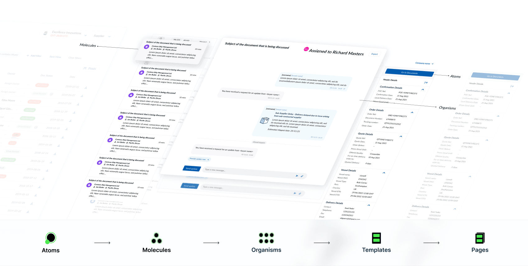
Why Atomic Design System?
Enter Atomic Design, a methodology created by Brad Frost, inspired by the principles of chemistry. This approach breaks down the design into its smallest components and systematically builds them up into complex, consistent systems. Atomic Design comprises five distinct levels: Atoms, Molecules, Organisms, Templates, and Pages.

Tokens
The smallest functional units of matter at the sub-atomic level, consistent with raw values. Represented by context-agnostic names or names with a shared semantic meaning to a majority group of items within a component.

Atoms
These are the smallest units that cannot be broken down into parts without losing their meaning.

Molecules
Molecules are combinations of atoms that work together to form more complex Ul elements, such as form fields, buttons with icons, navigation bars, or dropdown menus.
Organism
Organisms are complex UI components composed of molecules, atoms, and sometimes other organisms. These are relatively complex sections of a user interface that form distinct parts of a system..

Templates
Templates in atomic design are the equivalent of wireframes containing grayscale placeholders before real content is available, serving as foundational structures for page layouts and content organization.

Pages
In the atomic design, pages are instances of templates populated with real content, presenting the final output for user interaction and experience.
Picking the Right Tools
To make the system as scalable and easy to implement as possible, the right tools mattered.
TOOLS INTEGRATIONS
Figma

Choosing Figma has transformed our design system with its real-time collaboration and cloud-based accessibility.
Component based architecture.
Design and Prototyping.
Easy developer handoffs.
Consistency across multiple projects.
TOOLS INTEGRATIONS
Storybook

Choosing Storybook for our design system has revolutionized our development process by providing an isolated environment for building and testing UI components.
Robust documentation.
Interactive playgrounds for designers and developers
Easy collaboration and fast iteration.
Naming Conventions and Semantics
Implementing clear and consistent naming conventions and semantics is crucial for the success of a design system. Here’s a structured approach to naming conventions and semantics that can be followed:

IMPLEMENTATION OF DESIGN SYSTEM
Color Naming
Functional Naming: Name colors based on their function rather than their hue. Examples:
‘color-primary’
‘color-secondary’
‘color-accent’
Semantic Naming: Name colors according to their use in the UI. Examples:
‘color-success’
‘color-error’
‘color-warning’
IMPLEMENTATION OF DESIGN SYSTEM
Icon Naming
Name icons based on their function or appearance.
‘icon-search’
‘icon-close’
‘icon-user’
IMPLEMENTATION OF DESIGN SYSTEM
Component Naming
Atomic Design Approach:
Atoms: Basic building blocks like buttons, inputs, labels. Example:
‘btn-primary’
‘input-text’
‘label-default’
Molecules: Combinations of atoms like form groups, navigation items. Example:
‘form-group-login’
‘nav-item-link’
Organisms: More complex components like headers, footers, product cards. Example:
‘header-main’
‘footer-basic’
‘card-product’
Templates: Page-level structures that include organisms. Example:
‘template-homepage’
‘template-dashboard’
Pages: Specific instances of templates with real content. Example:
‘page-home’
‘page-about-us’
IMPLEMENTATION OF DESIGN SYSTEM
State Naming
Naming conventions for UI states are standardized names used to describe different states of UI elements (such as buttons, inputs, and cards) within a design system.
‘is-active’
‘is-disabled’
‘is-hidden’
‘is-loading

IMPLEMENTATION OF DESIGN SYSTEM
CSS Naming Conventions
BEM: Provides a structured way to create reusable and modular components, ensuring a consistent approach across a project.
‘button-primary--primary’
‘card--highlighted’
‘navbar__link--active’
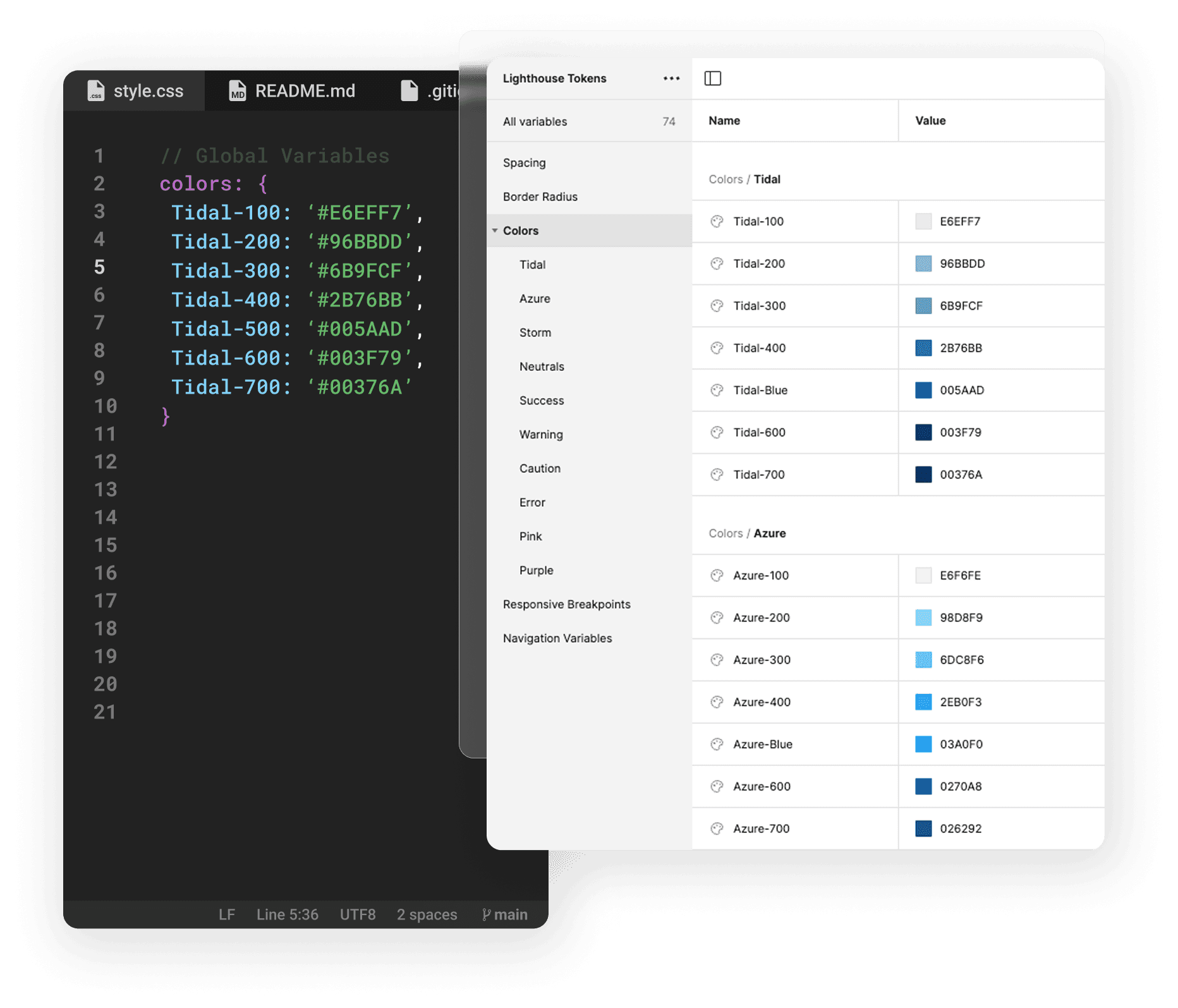
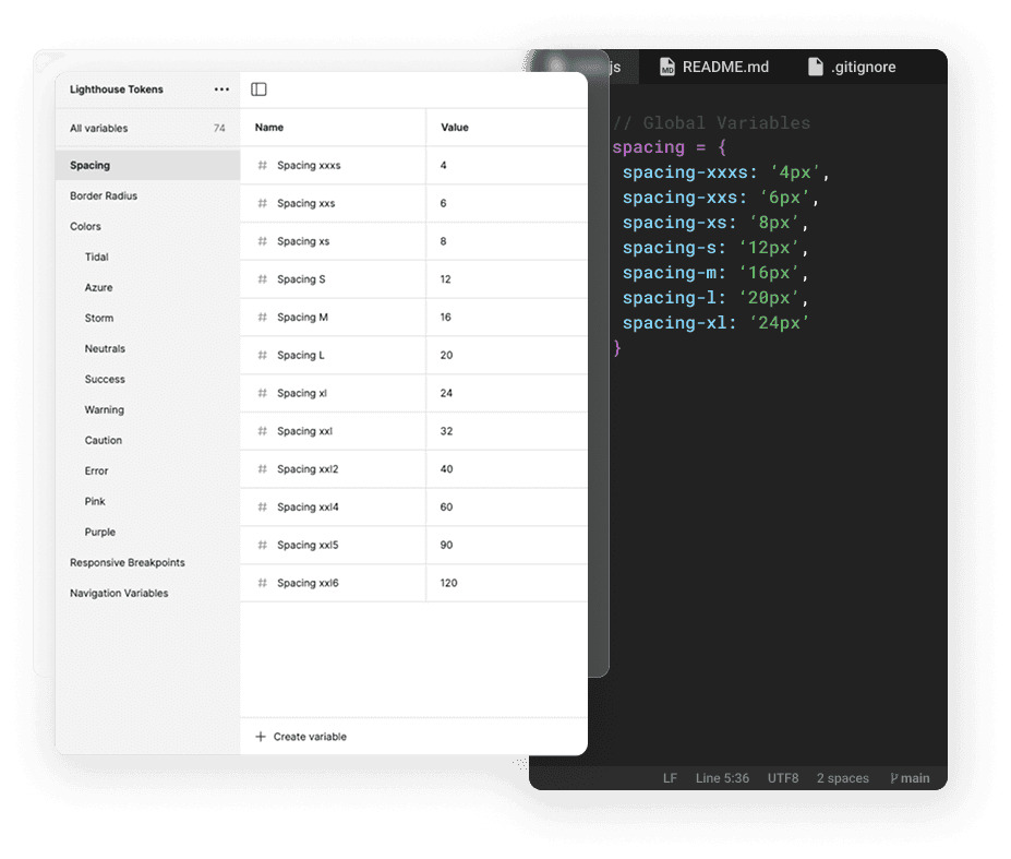
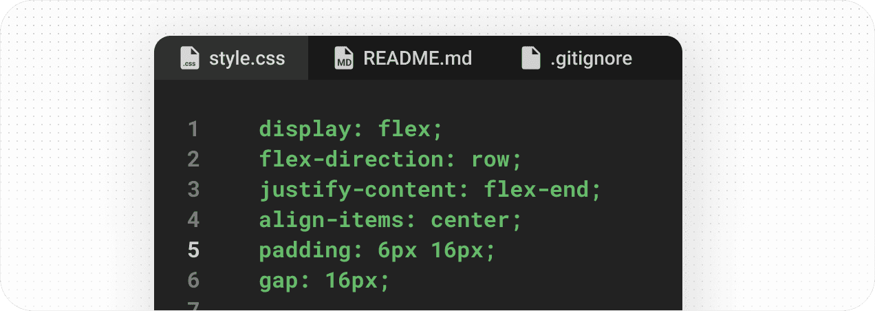
Setting up Tokens
Design tokens, which are variables that store design decisions like color values, typography, and spacing. This helps in maintaining consistency and easily updating global styles.
TOKEN STRUCTURE
Colour Tokens
Establish a set of standard colour values with meaningful names that reflect their purpose (e.g., primary, secondary, background, text-primary, text-secondary).
Setup colour tokens with proper naming conventions
Use colour tokens everywhere, with their proper usage defined
Maintain colours for the UI as per brand guidelines
TOKEN STRUCTURE
Spacing Tokens
By defining and applying standardised spacing values, teams can ensure that their UI elements are spaced appropriately, creating a visually harmonious and functional interface.
Define a consistent scale for spacing tokens, such as 4px, 6px, 8px, 12px, etc. This scale helps create a rhythm and hierarchy within the design. Examples: spacing-xs, spacing-sm, spacing-md, spacing-lg, spacing-xl.
TOKEN STRUCTURE
Typography Tokens
Typography tokens are standardized values that define the properties of text elements, such as font size, weight, line height, and letter spacing.
Define a set of typography styles for different text elements (e.g., headings, body text, captions).Examples of typography tokens might include font-size, font-weight, line-height, and letter-spacing. Font Family: Lato

Applying Atomic Design Principles
Design tokens, which are variables that store design decisions like color values, typography, and spacing. This helps in maintaining consistency and easily updating global styles.
IMPLEMENTATION OF DESIGN SYSTEM
Component Naming
Atomic Design Approach:
Atoms: Basic building blocks like buttons, inputs, labels. Example:
‘btn-primary’
‘input-text’
‘label-default’
Molecules: Combinations of atoms like form groups, navigation items. Example:
‘form-group-login’
‘nav-item-link’
Organisms: More complex components like headers, footers, product cards. Example:
‘header-main’
‘footer-basic’
‘card-product’
Templates: Page-level structures that include organisms. Example:
‘template-homepage’
‘template-dashboard’
Pages: Specific instances of templates with real content. Example:
‘page-home’
‘page-about-us’
IMPLEMENTATION OF DESIGN SYSTEM
Modular and Reusable Components
Reusable and modular components are UI elements designed to be used multiple times across different parts of a project without needing modification.
Consistency: Promotes a unified look and feel across different
parts of an application or multiple applications.
Scalability: Facilitates scaling the application or design system by
adding new components or updating existing ones without disrupting
the overall design.

Checking for WCAG Compliance
Ensuring WCAG compliance in component design is essential for inclusivity, providing equal access to all users, including those with disabilities. It helps meet legal requirements, reducing the risk of lawsuits and enhancing your brand's reputation. Accessibility leads to better usability, increased customer satisfaction, and a broader audience reach.
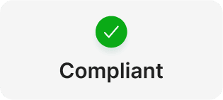
Status
We achieved an exceptionally
high compliance status.
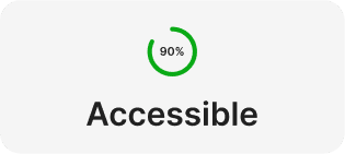
Accessibility Score
We are 90% + Compliant with WCAG 2.1 AA!

Lawsuit Risk
We have minimal exposure to accessibility-related lawsuits.
Implementation of the Design System
Based on extensive user testing of low-fidelity solutions, we designed the solution’s UI.

DOCUMENTATION
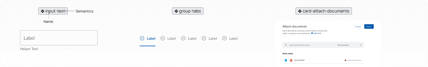
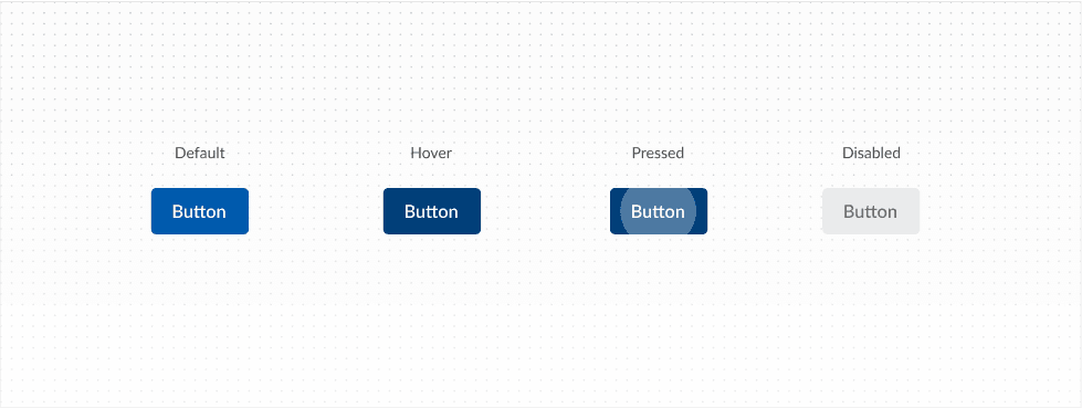
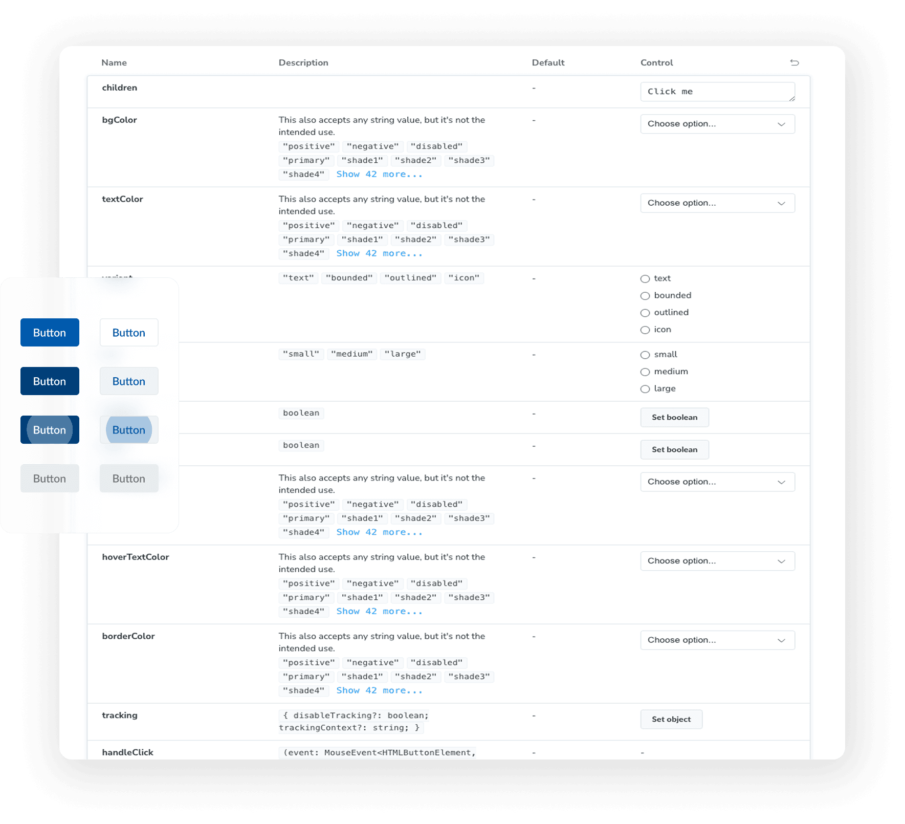
Component Properties
Displaying all possible variants of the component (e.g., different sizes, styles, states like hover, active, disabled).

DOCUMENTATION
Anatomy
Highlighting the key elements that make up the component (e.g., button text, icon, padding).

DOCUMENTATION
Usage Guidelines
Including detailed guidelines on how to use the component, including best practices and any constraints.
DOCUMENTATION
Code Snippets
Provide code snippets or links to code repositories where developers can find the component's implementation.
IMPLEMENTATION
Version Control
Version control in Figma is essential for managing a robust and consistent design system. It allows for real-time tracking, collaborative feedback, and secure management of design changes.
By leveraging Figma’s version control features, you can ensure that your design system evolves efficiently while maintaining consistency and integrity across all projects.


IMPLEMENTATION
Cross-Functional Collaboration
Cross-functional collaboration involves bringing together team members from various disciplines, such as design, development, product management, and marketing, to work jointly on creating and maintaining a design system.
This collaborative approach ensures that the design system meets the needs of all stakeholders, fostering a unified product vision and enhancing overall efficiency.
IMPLEMENTATION
Storybook Implementation
Storybook’s integration with popular frontend frameworks and its extensive add-on ecosystem enhances our workflow efficiency.
By leveraging Storybook, we've improved component reuse, streamlined testing, and created a more reliable, maintainable design system that drives innovation and ensures a seamless user experience.
Results and Benefits
Post-implementation, Shipserv saw a 30% reduction in design time and a significant improvement in user satisfaction due to consistent UI elements.
Design Time Reduction
Finding: Designers previously spent an average of 5 hours creating and iterating on new UI components.
Result: With reusable components, this time was cut down to 1.5 hours.
Impact: 70% reduction in design time for new features.
Development Speed
Finding: Developers took 8 hours on average to build and style new components from scratch.
Result: Time reduced to 2 hours using pre-defined design system components.
Impact: 75% reduction in development time for new features.
Update Efficiency
Impact: 70% reduction in design time for new features.
Result: With reusable components, this time was cut down to 1.5 hours.
Finding: Designers previously spent an average of 5 hours creating and iterating on new UI components.
Conclusion
The new design system has become a cornerstone of Shipserv's product development process, ensuring a cohesive and efficient design approach moving forward. Implementing a design system has increased team velocity by streamlining design and development processes, resulting in quicker product launches. Its standardized components and accessibility considerations ensure faster iterations and compliance, enhancing efficiency and reducing time-to-market.

