
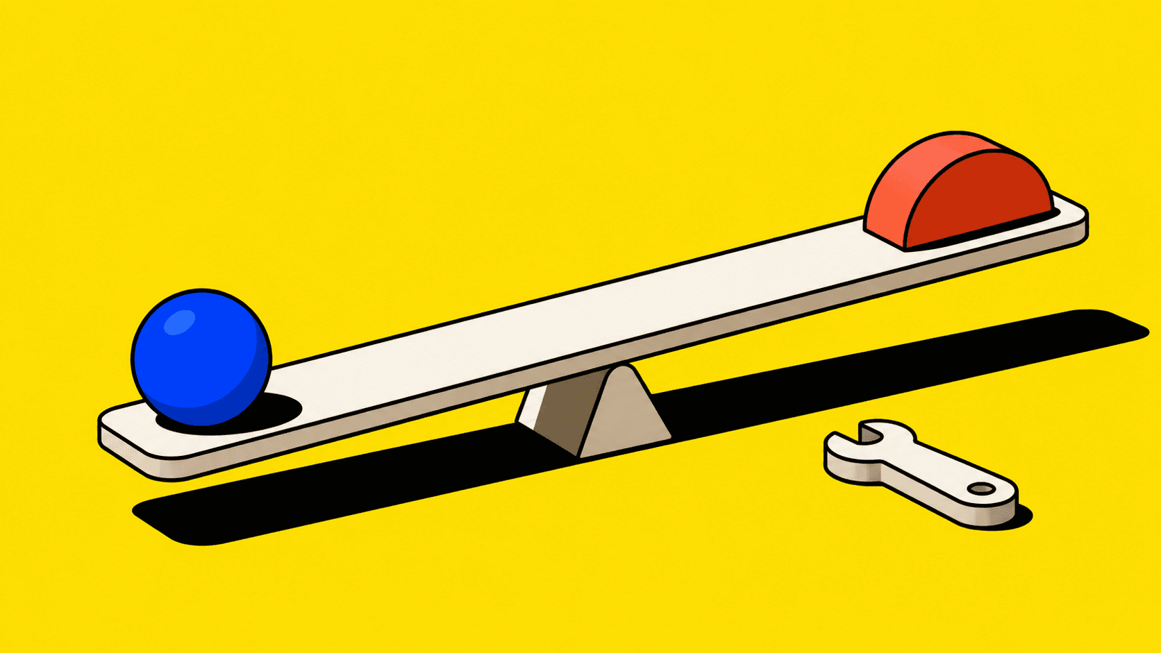
Product design is often described as making products easy to use. That is true, but incomplete. The harder part is making the trade-offs inside a product visible enough for a team to make good decisions.
Every worthwhile product contains competing needs. Customers want flexibility. Operations needs control. Sales needs a credible promise. Engineering needs a model that can survive the next feature. Finance needs accuracy. Product needs momentum. The interface is where all of those priorities eventually meet and, occasionally, argue.
A designer’s job is not to make complexity disappear with a larger border radius. It is to understand which complexity users need to see, which the system should manage for them, and which trade-offs the team needs to resolve before a screen is drawn.
Good product design starts before the UI
When a team begins with a screen, it often ends up debating the screen: which tab should be first, whether a control should be a button or a menu, how much information belongs in a table. Those decisions matter, but they are usually downstream of more important questions.
What is the customer actually trying to progress?
What is the core object or unit of work?
Which decisions are frequent, high-risk or irreversible?
What needs to remain visible for a person to trust the result?
What can the system safely automate, and where must people retain control?
These questions shape the product model. If the model is unclear, no amount of visual polish will make the experience consistently clear. You may produce an attractive interface, but users will still have to work around it when reality gets complicated.
The product is a set of decisions, not a set of features
Feature lists are useful for planning, but they can hide the shape of the problem. A user does not wake up wanting to “use the quoting feature” or “open the settings area”. They want to make a decision, move work forward or reduce uncertainty.
In enterprise products, that can mean creating a commercial proposal, resolving an exception, approving a change, assigning responsibility or understanding the current state of a transaction. The feature is merely one part of the decision environment.
This is why I like mapping products around a lifecycle rather than a collection of destinations. A lifecycle shows how work begins, changes hands, gains information, encounters exceptions and reaches an outcome. It gives the team a shared model for deciding where context should persist, where status needs to be explicit and where a user might otherwise be forced to reconstruct the story from tabs, emails and memory.
Clarity is not the same as simplicity
“Keep it simple” is excellent advice until it becomes an instruction to hide necessary complexity. A sophisticated product often supports complicated work because the work itself is complicated. Removing important controls, rules or evidence can make a prototype feel elegant while making the real task riskier.
The goal is not simplicity at any cost. It is comprehensible complexity.
That usually means:
Start with the common path and sensible defaults.
Reveal deeper controls when the task calls for them.
Make system suggestions, calculated values and manual overrides visibly different.
Preserve context while a person makes a decision.
Make important changes traceable and reversible where possible.
Use language that reflects the customer’s work, not the organisation chart.
That is product design at its most useful: not pretending a complex decision is trivial, but giving people enough structure to make it with confidence.
Design the states, not just the happy path
Most products look convincing on the happy path. The real test arrives when data is incomplete, a value has been overridden, a colleague has already acted, an integration fails, a permission is missing or a customer changes their mind at the inconvenient moment they have every right to.
These are not edge cases in operational products. They are the work.
A durable design explores the state model early. What is draft, pending, active, blocked, confirmed, cancelled, superseded or historical? Which transitions are allowed? Which need approval? What does the user see when something failed? What needs an audit trail?
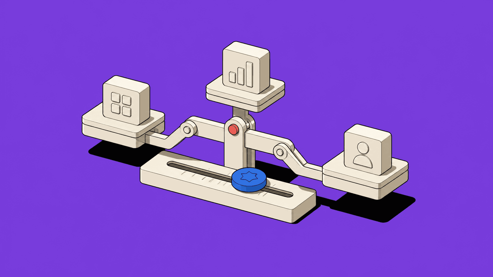
Status deserves particular attention. It is not decoration. It tells people what has happened, what matters now and what they can do next. When status is vague or inconsistent, users lose trust long before they complain about the colour of a button.
Use artefacts to make disagreement productive
Senior product-design work is often less about producing a final screen and more about making ambiguity discussable. Commercial teams, operations, engineering, support and leadership can all view the same problem through a different but legitimate lens.
The useful design artefacts are the ones that help them reason together:
A journey map that reveals where a customer loses momentum.
A service blueprint that shows the backstage data, people and systems behind a visible experience.
A lifecycle model that clarifies how a record moves through a process.
A prototype that turns an assumption into something people can react to.
A status taxonomy that gives the product one consistent language.
A decision log that records why a trade-off was made and what evidence supported it.
These are not ceremony. They reduce the chance that a team ships a tidy answer to a problem it has not agreed on. They move the conversation from “I think” to “what happens if?” That is a much better question to ask before development begins.
Design systems make good decisions reusable
A design system is often introduced as a consistency programme. Its greater value is that it makes hard-won decisions reusable. A system can encode not only typography and components, but patterns for statuses, permissions, empty states, overrides, related records, error recovery and auditability.
At ShipServ, the Lighthouse design system made design and code work from the same foundations, components and documented behaviours. The result was faster delivery, but more importantly, a shared product language. I explore that in my ShipServ design-system case study.
The principle carries across products: when a team solves a recurring problem once and can confidently reuse the answer, it saves time for the genuinely new work. A component library alone cannot do that. The system needs to capture behaviour and intent, not just appearance.
Measure confidence as well as efficiency
Product measures often focus on speed: completion time, conversion, clicks or throughput. They are valuable, but they are not enough. A person may complete a workflow quickly and still be unsure whether they made the right decision. In a high-value or high-risk task, that uncertainty is a design problem.
I would pair behavioural measures with questions such as:
Can users identify the current state without external help?
Can they explain why the system made a recommendation?
Can they recover from a mistake without losing important work?
Do they know what will happen next and who is responsible?
Are support questions and workarounds declining as the workflow matures?
Sometimes the right outcome is fewer steps. Sometimes it is a slightly longer journey with clearer evidence, better controls and less risk. The aim is not simply to reduce interaction. It is to reduce uncertainty.
AI makes the design judgement more valuable
AI can now generate screens, variants, copy and interactive prototypes at extraordinary speed. That is useful, but it changes where the value sits. The bottleneck is increasingly not the production of options. It is knowing which option respects the product model, the customer’s context, the business rules and the moments where trust matters most.
I use AI to accelerate exploration, turn rough thinking into discussable artefacts and test alternative structures sooner. It is particularly good at getting a team from a blank page to a useful conversation. But a plausible interface is not proof of a sound product decision. Someone still needs to understand the workflow, ask about exceptions and decide what must remain under human control.
The product designer’s real contribution
The best product design does not always announce itself. It shows up when a complex workflow feels coherent, when users can act without hunting for context, and when a team can add new capability without inventing the product again each time.
That is why I think product design is the work of making trade-offs visible. It gives a team a way to see the customer need, the business constraint, the system behaviour and the delivery consequence in one place. Once those things are visible, better decisions become possible.
And better decisions are what customers experience as a good product.

