
Analyze, benchmark, and compare procurement datasets.

Project Result
Monthly trade business upgrades
System Usability Score
Ease of Use Score
Problem Statement
Suppliers require a way to analyse, benchmark and compare procurement datasets. The SIR displayed a visual representation of their statistical data. Users should be able to view the report and extract critical information for their organization. We aimed to create a modular design that supports easy drop‑in/out modules and facilitates a smooth transition to responsive screen sizes.
Guiding Principles
During the research process, we are using some tools to gather data and information and carry the research process
PRINCIPLE
Tesler' Law
Every application has an inherent complexity that cannot be reduced. The complexity must be handled by the system or the user.
PRINCIPLE
Hicks' Law
The time it takes to make a decision increases with the number and complexity of choices.
PRINCIPLE
Jakob’s Law
Users spend most of their time on other sites, so they prefer your site to work similarly to the sites they already know.
PRINCIPLE
Postel’s Law
Be conservative in what you do, be liberal in what you accept from others.
PRINCIPLE
Peak-End Rule
People judge experiences based on how they felt at the peak (best or worst moment) and the end, rather than the total sum or average of every moment.
PRINCIPLE
Miller’s Law
The average person can hold about seven (plus or minus two) items in their working memory.
Project Classification
Based on the UX strategy we had documented, the project was classified as research-heavy, and he following framework was applied
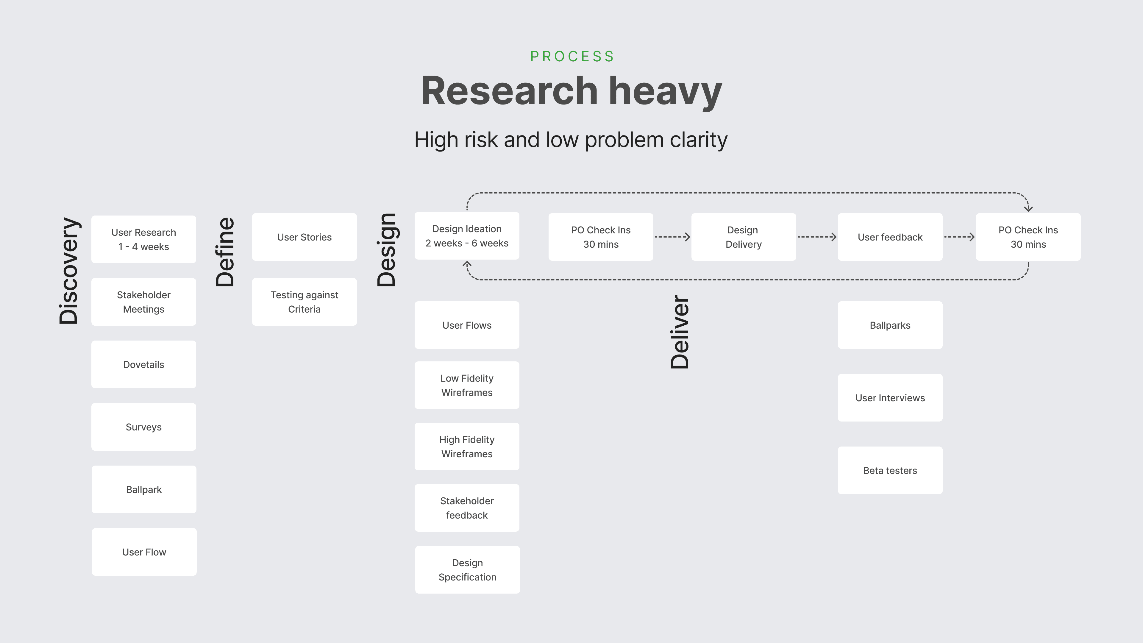
Tools Used
The toolset used was geared around low-fidelity iteration, along with qualitative and quantitative data gathering and analysis.
Miro

Miro was chosen as a tool to ideate, collaborate with stakeholders and create lo-fi art initially.

Easy to collaborate.
Non-visual.
Perfect for user flow diagrams.
Figma

Figma is a go-to tool for development-ready design and annotations.
Component-based architecture.
Design and Prototyping.
Easy developer handoffs.
Dovetail

Dovetail provided us with a way to interview and categorise commonalities in pain points.
Easy to capture video interviews.
Automatic transcription.
Tagging and commonality cataloguing.
HotJar

Hotjar provides us with a way to capture instantaneous user feedback.
Instant user tracking.
Heatmap and engagement tracking.
Rage click and u-turn tracking.
Google Analytics

Google Analytics gave us in-depth insight into user activity.
Comprehensive user tracking.
Bespoke trend tracking.
Easy to integrate with data visualization tools like Power BI.
Power BI

Power BI gave us a way to visualise data in a way that stakeholders could interact with easily
Easy to share engagement metrics with stakeholders.
Robust integrations.
Flexible data visualisations.
UX Research
The toolset used was selected with qualitative and quantitative data collection in mind.
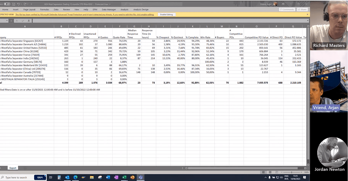
Exporting Data

Man Energy Solutions
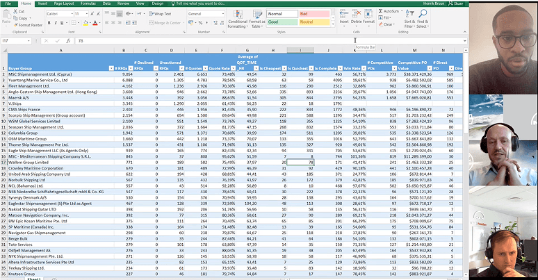
“Data manipulation and export is important to us for capturing periods of time and internal circulation.”
Storytelling

Caterpillar
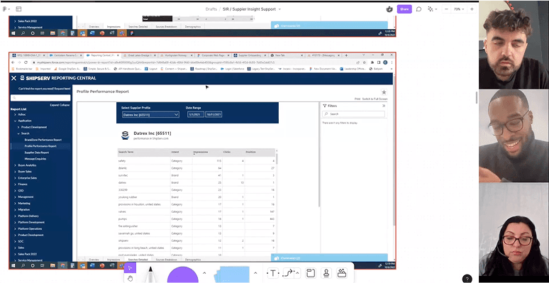
“We use data for storytelling. Visualisation is very important to us as it creates a compelling story.”
Understanding our Customers
Alfa Laval
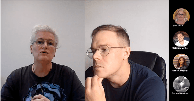
“We want to understand who our best customers are, and also how that changes over the course of the year”
Comparing Time Periods
Kerger & Co.
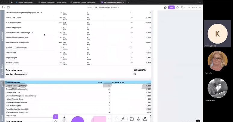
“We see a lot of value in being able to compare months, quarters and years to identify trends in our performance.”
Performance Matters
Hamworthy
“Speed matters for us and so understanding our responsiveness and benchmarking it against our competitors is important.”
Break the Data Down
RS Components
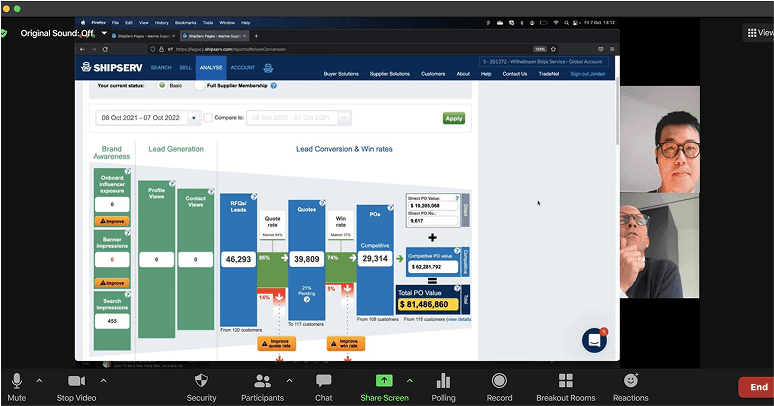
“The data is more relevant when broken down by quote rate, number of quotes, and number of quotes per buyer.”
Low Fidelity Ideation
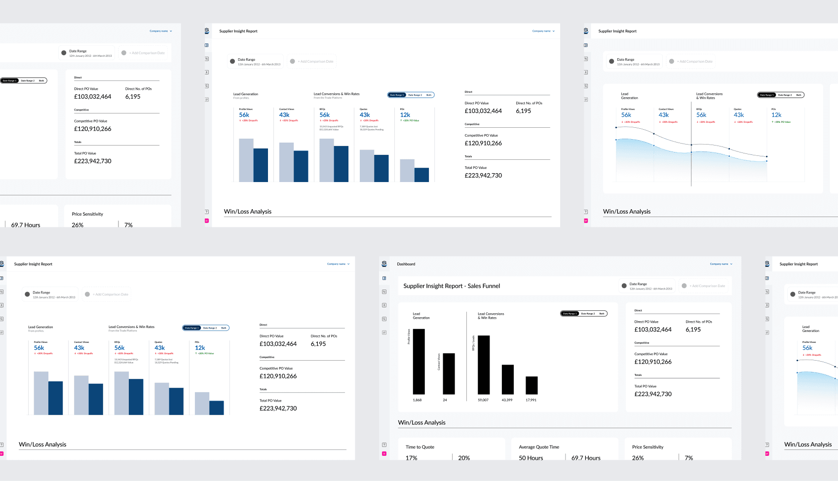
During the research process, we are using some tools to gather data and information and carry the research process.
Feedback
During the research process, we used ballpark and user interviews to gather feedback.

“Very easy to read. Would like to be able to compare previous period.”

“It looks like I’ll use it all the time, excellent idea.”
“Easy to use, and it allows to modify the format or item to quote.”
“It seems to be well designed and very user-friendly. It has everything you need!”
Conclusions
Based on our extensive research and customer engagement, we drew preliminary conclusions about the MVP feature-set.
Comparing Date Ranges
Users consistently asked to be able to compare sales data either month on month or year on year. A robust date-picker is mandatory.
Drop off Report
Users want to know the effectiveness of their quoting, and be able to benchmark it against competitors.
Best Customers
Users saw immense value in being able to sort counterparties by PO spend over certain time periods.
Designing the Interface
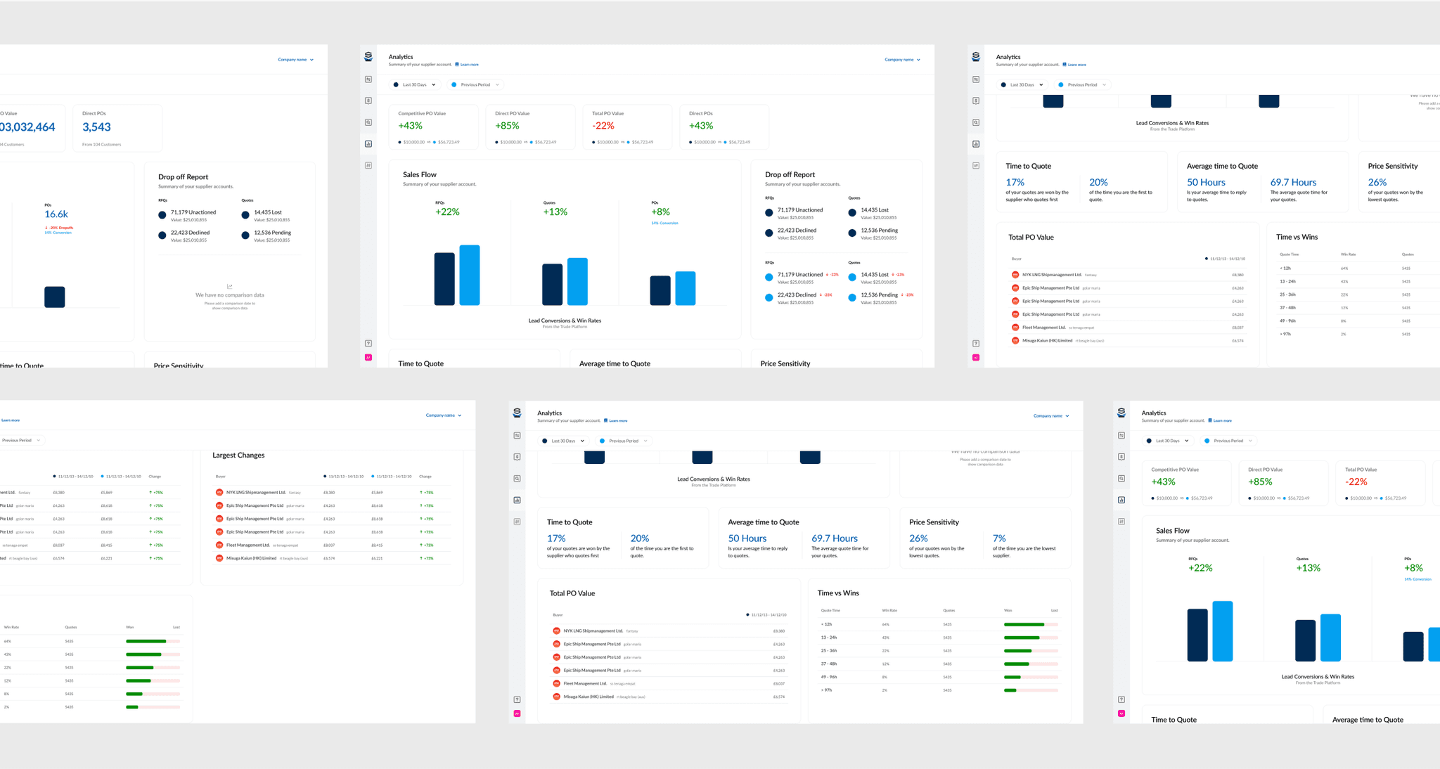
Based on extensive user testing of low-fidelity solutions, we designed the solution’s UI.
IMPLEMENTATION OF DESIGN SYSTEM
Sales Funnel Comparison
Sales analytics can be shown for a select period (the default being the last 30 days), or a custom date range. Users can also compare date ranges.
By hovering over the section for the RFQs, Quotes or POs, further details will be displayed, such as total number of transactions and value.
When two ranges are selected, the user can see the delta in monetary value as well as the the percent difference.


IMPLEMENTATION OF DESIGN SYSTEM
Core Sales Metrics Comparison
The user is able to review their time to quote as compared to the average time other suppliers quoted in order to analyse their quoting time performance.
Users can also review overall price sensitivity to see how their quote/prices compare to others in the industry.
Below, users can see a comparison in business conducted with their most frequent cou nterparts.
IMPLEMENTATION OF DESIGN SYSTEM
Time vs Win
With Time to Quote being such a valuable metric for both our customers and us, we provided a glanceable overview of Time to Quote vs win rate in the selected period.


IMPLEMENTATION OF DESIGN SYSTEM
Drop-Off Report
This module is a glanceable report to show the user where they had drop-offs, at both the RFQ and Quote stage of the requisition process.
By comparing two date ranges, the user can quickly see whether their drop-offs are increasing or decreasing.
Drop-offs are calculated numerically and with a dollar cost, plus the delta differential.
Click Analysis
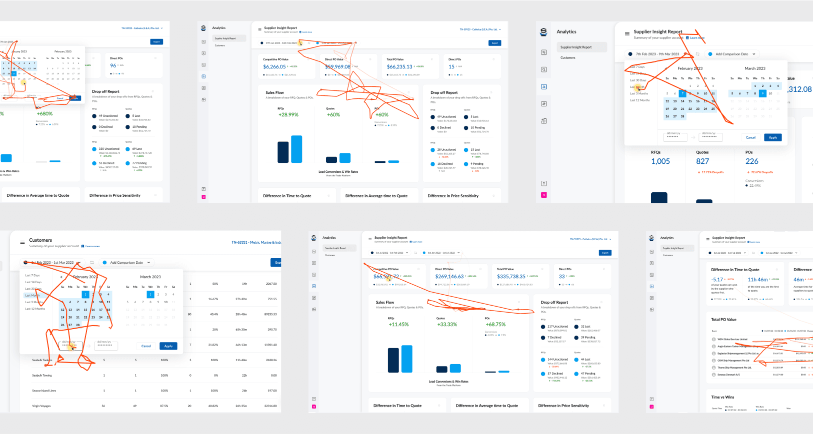
We observed significant engagement with the date-picker, vindicating the effort we spent in providing a robust solution.
Launch and Analysis
With the design, development and QA done, it was now time to take the feature to market.
IMPLEMENTATION OF DESIGN SYSTEM
Go to Market
Along with traditional product marketing efforts, we used intercom to draw attention to the new menu item.
The benefit of this was two-fold. It allowed us to not only draw attention to the feature but also analyse engagement and isolate future alpha testers.
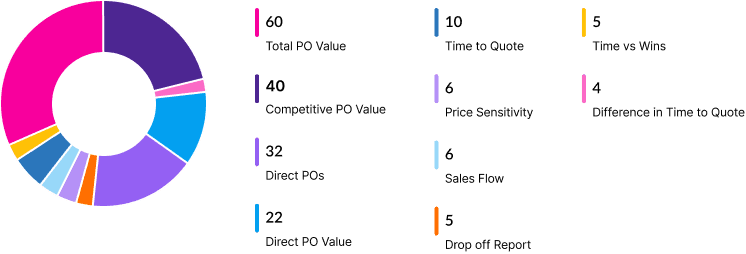
Breakdown of Page Engagement
Users were primarily concerned with the total amount of Purchase Order value over a set period, and also had an interest in competitive vs direct POs.
IMPLEMENTATION OF DESIGN SYSTEM
# Views and # Users by Date
The feature was launched to beta testers early March, with wider release and GTM strategy 2 weeks later. We saw an initial explosion of unique views and users, which tailed off over the following months, stabilising to expected retention levels throughout 23/24.

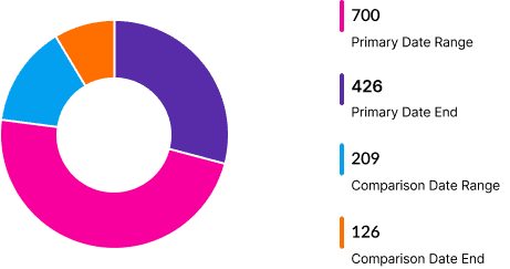
Date Range Engagement
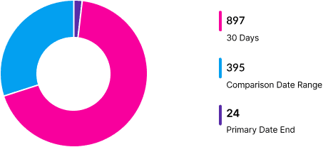
Users wanted to engage with pre-defined date ranges and comparison ranges vs custom ranges
Date Range Analysis
Users spend most of their time on other sites, so they prefer your site to work similarly to the sites they already know.
IMPLEMENTATION OF DESIGN SYSTEM
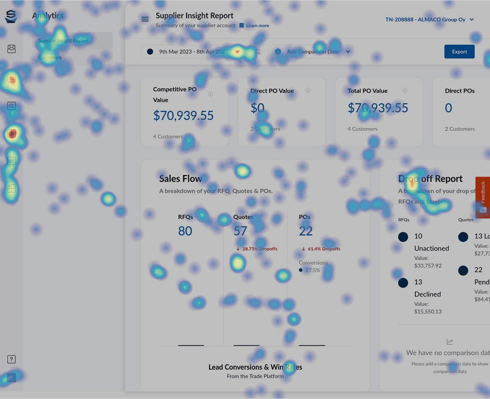
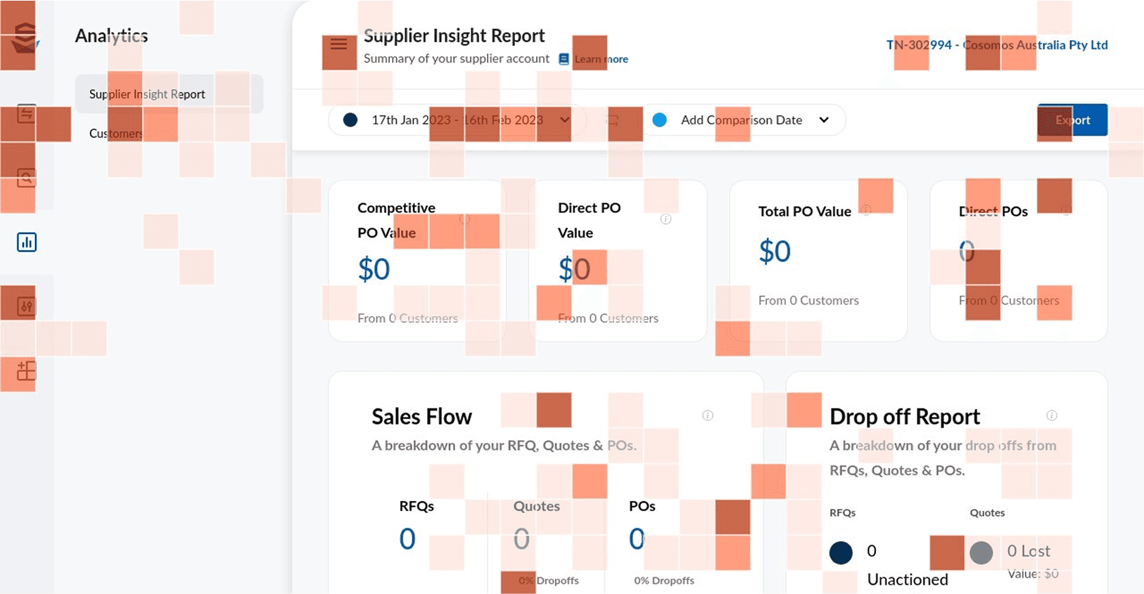
Heat-map Click Analysis
Concentrated user activity around the date-picker, comparison date range and drop-off report gave us the confidence that we had developed an initial feature set which met users’ needs.
IMPLEMENTATION OF DESIGN SYSTEM
Engagement Tracking
Concentrated user activity around the date-picker, comparison date range and drop-off report gave us the confidence that we had developed an initial feature set which met users’ needs.
Engagement tracking captured clicks as well as highlighting and cursor hover events.
While we saw that users engaged with the date range selection, they also copied the PO value and drop-off numbers.
This indicated that the data we provided to users was valuable.
Feedback
During the research process, we used ballpark and user interviews to gather feedback.
MEASURE
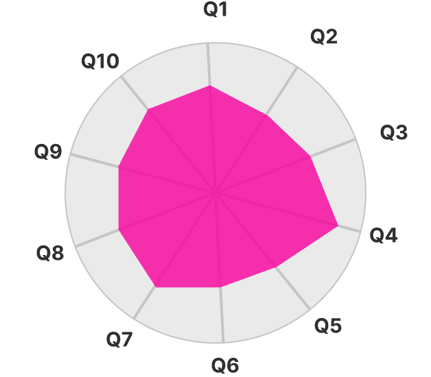
System Usability Score
Net Promoter Score (NPS) is a measure used to gauge customer loyalty, satisfaction, and enthusiasm with a company that's calculated by asking customers one question: “On a scale from 0 to 10, how likely are you to recommend this product/company to a friend or colleague?”

NET PROMOTER SCORE
NPS Distribution
MEASURE
Ease of Use Score
Net Promoter Score (NPS) is a measure used to gauge customer loyalty, satisfaction, and enthusiasm with a company that's calculated by asking customers one question: “On a scale from 0 to 10, how likely are you to recommend this product/company to a friend or colleague?”

“Very easy to read. Would like to be able to compare previous period.”
“It looks like i’ll use it all the time, excellent idea”
“Easy to use, and it allows to modify the format or item to quote.”
“It seems to be well designed and very user-friendly. It has everything you need!”
Revenue Generation
We saw this feature-set as valuable enough to be included in our business tier exclusively.
IMPLEMENTATION OF DESIGN SYSTEM
Paywalling Feature
Basic users were met with a block screen, which encouraged them to upgrade to access sales analytics.
With GTM events, we tracked page views, click events, and entry to the Intercom upgrade sales funnel.

Conversion Events
Data tracking “Upgrade Now” click events and then engagement with a sales representative enquiring about upgrading their account.